🆕 Pull Request File Tree (Beta) Feedback #12341
Replies: 2398 comments 638 replies
-
|
Great addition to PR reviews! This is a much easier way to navigate and visualize changes in a PR. If/when this hits public release please give the option to pin it to the right side instead of only the left! |
Beta Was this translation helpful? Give feedback.
-
|
Looks good! Even if really big PRs, I can finally filter using part of the filename, which was close to impossible before! 👏🏼 |
Beta Was this translation helpful? Give feedback.
-
|
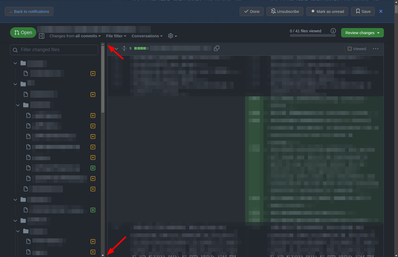
Great addition! But I think, that a indicator should be added, at which File you are currently looking (because you can scroll like before, but the indicator itself does not update its location) |
Beta Was this translation helpful? Give feedback.
-
|
Looks great so far 🎉 if I had some suggestions for improvements:
And a single bug I've come across
|
Beta Was this translation helpful? Give feedback.
-
|
Great addition! 🌾 Found a possible bug:
|
Beta Was this translation helpful? Give feedback.
-
|
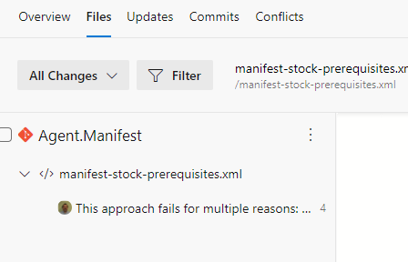
Looks good. As a suggestion I would like to see which files have comments in the tree. |
Beta Was this translation helpful? Give feedback.
-
|
Looks not so good on 4k resolution: |
Beta Was this translation helpful? Give feedback.
-
|
I like it but I wanted to disable it to test something but disabling it in feature preview does nothing and I still seeing file tree. |
Beta Was this translation helpful? Give feedback.
-
|
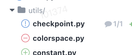
Love the new feature. Here is a mock up of how it could look if a file is marked as |
Beta Was this translation helpful? Give feedback.
-
|
This is a great feature! I am already using an extension for PR tree, is in the road map to implement the features of the browser extension?
|
Beta Was this translation helpful? Give feedback.
-
|
Nice addition. The feature does not seem to work in the commits tab of the PR. In our shop, we typically do commit-by-commit reviews and rarely use the files changed. It would be nice to have the file tree in commits as well. |
Beta Was this translation helpful? Give feedback.
-
|
This is such a great feature. |
Beta Was this translation helpful? Give feedback.
-
|
First of all amazing feature, cheers! In a long diff, clicking a file name for the first time correctly positions the view and highlights the file with blue marker but clicking a second time moves the view a bit down and obscures the highlight. I would expect the second click do nothing -- maybe fold/unfold the file. |
Beta Was this translation helpful? Give feedback.
-
|
It's really useful but some minor points:
|
Beta Was this translation helpful? Give feedback.
-
|
I like the ability to navigate the file tree, but I wish it would remember whether the drawer/sidebar was open/closed. I often have GitHub in a narrow window (as GitHub is fits comfortably in a narrow window), but with the file tree defaulting to open the space for the diff is greatly reduced. |
Beta Was this translation helpful? Give feedback.
-
|
I don't know if this has been suggested elsewhere, but I'd really like a "File filter" option to filter files that have been renamed without changes. When moving large directories around, this can really slow down the UI and add a lot of noise to a review. |
Beta Was this translation helpful? Give feedback.
-
|
For those PRs with lots of files, it'd be great if the active file, or one that's the first file within the viewport, was highlighted in some way in the file tree. That way I could tell as I'm scrolling through where exactly the file I'm looking at exists relative to the other files I'm reviewing. It also gives me a sense of how far through the PR I am. |
Beta Was this translation helpful? Give feedback.
This comment was marked as spam.
This comment was marked as spam.
-
|
With ~2.000 changed files, the tree is not usable on Firefox. -- PR https://github.com/JabRef/jabref/pull/10646/files
|
Beta Was this translation helpful? Give feedback.
-
|
Great addition! But I think, that a indicator should be added, at which File you are currently looking (because you can scroll like before, but the indicator itself does not update its location) |
Beta Was this translation helpful? Give feedback.
-
|
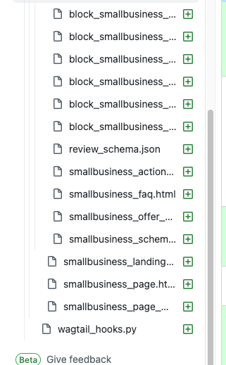
Can you do something to make the full packages and file names visible? Currently is it not possible to see the full name in any way, because the file tree window is not re-sizable. Maybe there could be balloon popups? |
Beta Was this translation helpful? Give feedback.
This comment was marked as off-topic.
This comment was marked as off-topic.
-
|
Hard to believe, but it is year 2024 and the file tree still has a fixed width Just as a reference, the concept isn't that new https://balsamiq.com/learn/ui-control-guidelines/splitters/ ;) |
Beta Was this translation helpful? Give feedback.
-
|
Would be very helpful to be able to navigate between files with up and down arrow buttons. |
Beta Was this translation helpful? Give feedback.
-
Beta Was this translation helpful? Give feedback.
This comment was marked as off-topic.
This comment was marked as off-topic.
This comment was marked as off-topic.
This comment was marked as off-topic.
-
Yes please!! I'm having to keep browser devtools open to inspect the full file name or folder name which isn't cool. Making the file structure expandable or resizable would be even better. <3 |
Beta Was this translation helpful? Give feedback.


-
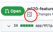
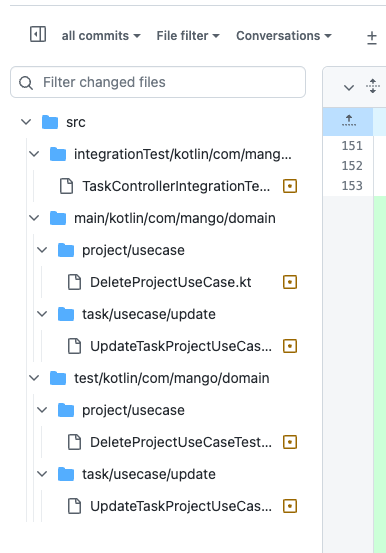
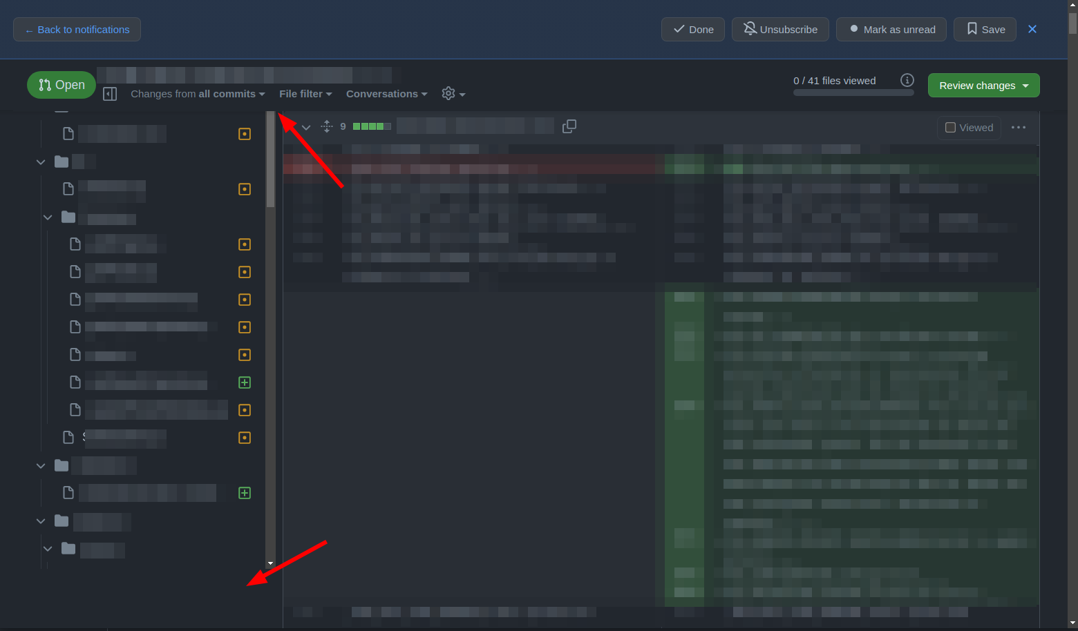
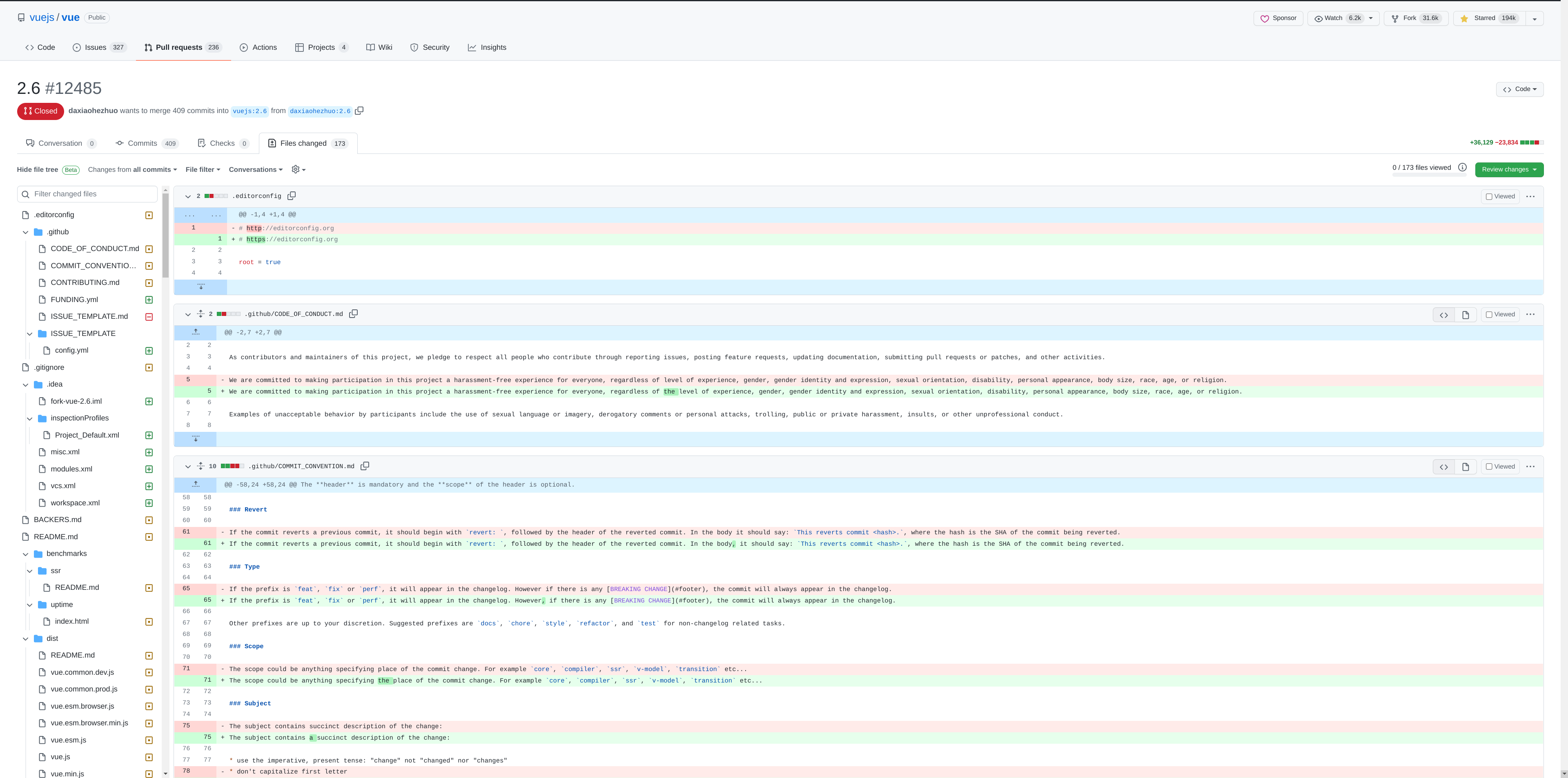
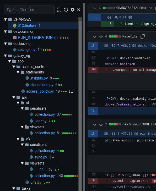
For the past few months, we've been working hard to improve the Pull Request experience. One of the features we're most excited about: Pull Request File Tree. The new tree:
See the changelog for [a few more] details.
What you need to know
The file tree only appears if the pull request has at least 2 changed file and your browser window is sufficiently wide.
During the beta, you can disable the tree completely via the feature preview dialog. When disabled, you will no longer have the option to hide or show the tree from the pull request page. If you change your mind, you can re-enable the tree in the feature preview dialog.
Most common issues
The full list of issues we're tracking is longer than this, but the following are the most commonly reported:
Tkeyboard shortcut not workingFeedback
Your feedback will help inform what's ultimately shipped in the GA release, so please let us know what you think below. We're excited to hear from you ✨
Beta Was this translation helpful? Give feedback.
All reactions