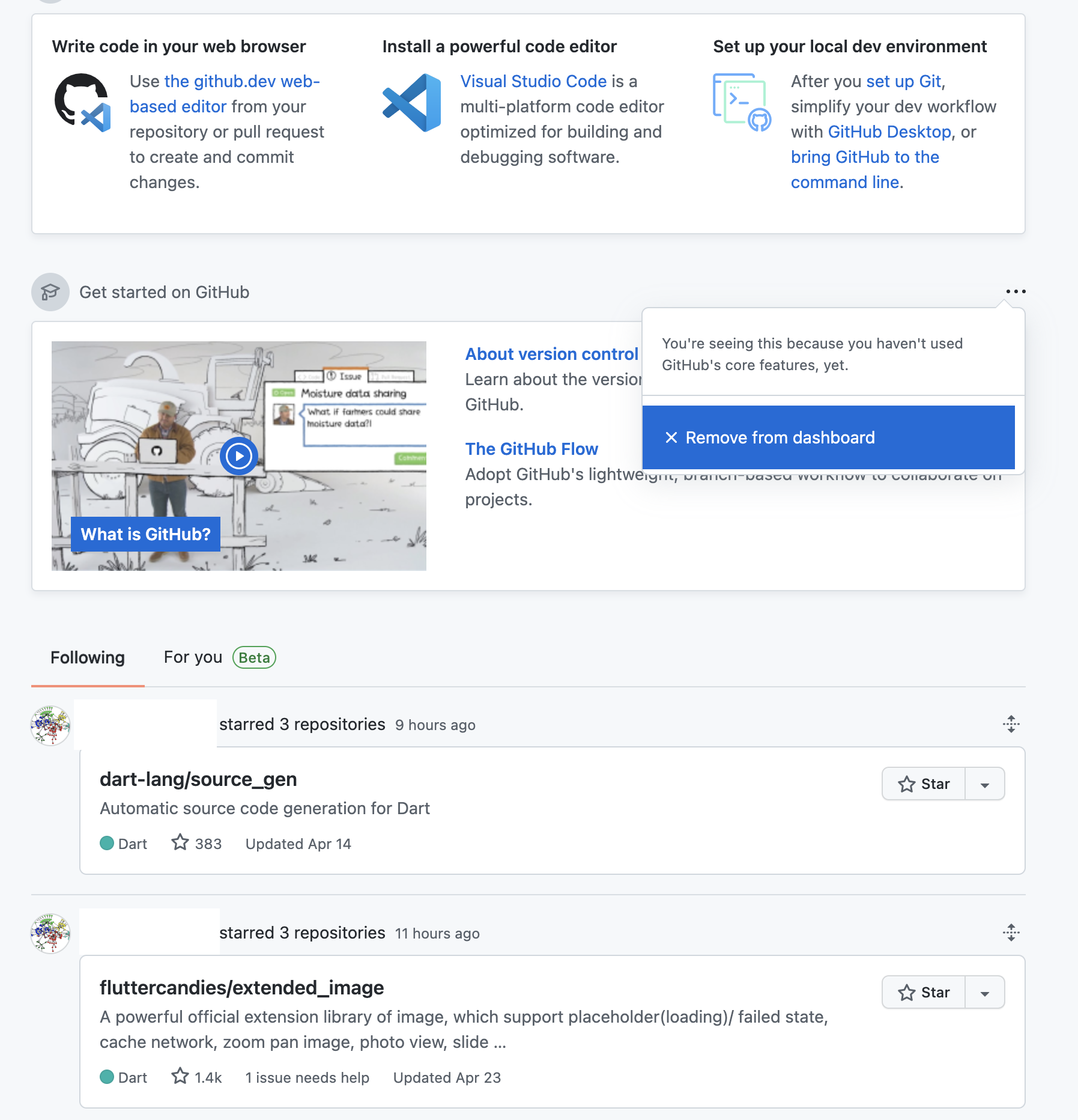
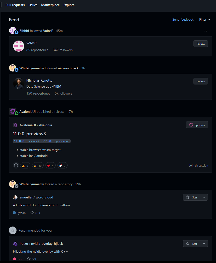
I don't want algorithmic feed #13131
-
|
I just want a feed on things that matters:
Also the ability to mute things I don't want to be notified anymore. Also the new feed crashes on Chrome mobile, occasionally. We already lost the recent activities dashboard, don't kill the feed too. |
Beta Was this translation helpful? Give feedback.
Replies: 39 comments 43 replies
-
|
Agree. I don't mind an algo-feed existing for people who do prefer it (or, for that matter, if our dash is ~widgetized), but I want predictable chronological feeds. |
Beta Was this translation helpful? Give feedback.
-
|
Me either, can we have an option to opt out "For You" tab? |
Beta Was this translation helpful? Give feedback.
-
|
+1 to muting people or events (or events by people) -1 to the algorithmic feed. Just looking at it, most was people I don't know and don't care about interacting with projects that are not interesting. There's a lot of work to be done here if it is ever to be useful Less noise not more please :) |
Beta Was this translation helpful? Give feedback.
-
|
Yup. I thought we were over this. Don't forget to like and subscribe |
Beta Was this translation helpful? Give feedback.
-
|
I'd actually love this feature. For people who don't, maybe a toggle in settings to turn off the feed. As Github have a lot of data on how we interact with certain projects, It might actually be helpful for us to discover similar projects |
Beta Was this translation helpful? Give feedback.
-
|
The release / issues / pr feed is good for the "following" tab. On my side, I would like to discover more projects from people I don't know, or issues I could contribute. Currently, I just have a feed of people who are following me, which is not interesting for me. It's just the "following" tab but filled with my followers, and this is not interesting. |
Beta Was this translation helpful? Give feedback.
-
|
Thanks for the feedback! We do have plans to experiment with the ability for the viewer to toggle between chronological and algorithmic. Regarding muting – do you find yourself looking for the ability to mute...
|
Beta Was this translation helpful? Give feedback.
-
|
In general I think it looks okay, but there's a bit too much stuff I'm really not interested in:
Generally, I like suggestions and the feed of starred repositories, but this is just way too much stuff that I don't care about. |
Beta Was this translation helpful? Give feedback.
-
|
Dear @github-staff, I would like to ask you to also consider the potential impact of those on the other side of this i.e. the users whose actions, without consent, may be either amplified or diminished by an algorithmic feed. For many of us, GitHub is part of our livelihood, and the gamification of it could lead to extra stress we could do without. There are other platforms well-placed for promotion and dissemination of our work - please consider deferring to those, instead of making it a compulsory part of this site. |
Beta Was this translation helpful? Give feedback.
-
|
Most developers and consumers prefer open-source tools to increase data privacy and transparency. An algorithmic feed might translate to collecting more data, and it doesn’t align with the open-source community. Also from a functionality standpoint, it does not seem different from “ |
Beta Was this translation helpful? Give feedback.
-
|
I was expecting to see PRs that are created by my followings! |
Beta Was this translation helpful? Give feedback.
-
|
👍, Me either |
Beta Was this translation helpful? Give feedback.
-
|
Fully agree! And the old recent activity feature is really missing: |
Beta Was this translation helpful? Give feedback.
-
|
I'm getting star notifications from users I'm not currently following, but I'm not really interested. I hope that the displayed list will remain the same as before, leaving only batches such as stars. |
Beta Was this translation helpful? Give feedback.
-
|
I hate the new trend of "tailored experiences", but if GitHub is going to force a completely useless feed, at least give the option to be able to remove people and repositories that we don't care about. I see cards for things I have not been involved with for a long time and do not care to see it. |
Beta Was this translation helpful? Give feedback.
-
|
Please stop piling junk on this site. You already added enough stuff that nobody needs. It's distracting, time consuming, and worsens the site |
Beta Was this translation helpful? Give feedback.
-
|
The new for you feed is less relevant than before. Social media for programmers already exists via subreddits and services like discord, gitter, telegram,... I want a feed that shows me activity concretely based on what I'm watching or subscribed to. I do not need extremely popular repositories like sphinx or vscode recommended to me! Stars are a dreadful metric on this website because they say very little about whether a repository is useful to an individual. The more you have the more general your repository's audience is: the less relevance it has to a specific user. |
Beta Was this translation helpful? Give feedback.
-
|
I see something new on the dashboard but there isn't an option to remove feed (yet) (And it's a little irrelevant to show "get started on github" to someone who has been using it actively for more than 13 years) |
Beta Was this translation helpful? Give feedback.
-
|
hey there just adding my agreement to this thread. |
Beta Was this translation helpful? Give feedback.
-
|
The thing that made GitHub great was that it was concise. Recently a lot of garbage features have been introduced that do nothing but clutter and distract. The feed is only useful for marketing. GitHub should not be yet another marketing tool. |
Beta Was this translation helpful? Give feedback.
-
|
update: they ruined github |
Beta Was this translation helpful? Give feedback.
-
|
I am posting here just to express my agreement and because I am genuinely mad. Instead of a clean overview of people that I follow and events happening in my repos (stars, forks, issues, etc.) I now have to look at some random algo generated bullshit that presents to me things that I don't follow or ever have looked at. I thought that there was explore tab for this exact reason. I was already very close to switching to GitLab since people I work with use self-hosted servers for it anyway and this might be the last straw. |
Beta Was this translation helpful? Give feedback.
-
|
Please let me go back to just seeing the events for people and repos I've explicitly followed; this newsfeed is useless to me. I don't come to Github for social networking or to kill time, I come here to get work done and learn things. Engagement with a newsfeed is a pretty poor choice of metric to optimize IMO. |
Beta Was this translation helpful? Give feedback.
-
|
Imagine having all the money in the world and owning an incredible product like Github and one of the first things you do is to go absolute gutter trash levels of "innovation" with a LinkedIn style feed. Imagine the minds at work and their complete lack of awareness or tact. |
Beta Was this translation helpful? Give feedback.
-
|
I can't remember how the GitHub dashboard looked before the feed was introduced and how it looked throughout the various feed iterations. I just remember noticing that it is more and more frustrating and useless. At the time of writing this comment, it got to a point where I am interested in the top-left 10% of the screen and my brain shuts out everything else. The useful area is so small that it could fit on a mobile phone screen without scrolling. When I open GitHub, I almost always want to do one of:
Why? Because I set out to work on a particular thing so I need to find the project that I want to work on and find an issue or PR in it. I don't want to see all my issues or PRs from all projects because there is a lot of them and they are irrelevant at that time. Once a year I want to:
What I never ever ever ever needed:
What is useless beyond imagination:
So in summary, from the whole 1920x1080 screen, I use
The UX is just bad, there is no way about it. |
Beta Was this translation helpful? Give feedback.
-
|
Please let me turn off the right-hand sidebar, the one featuring "Trending Repositories". I actively dislike it, it's distracting, and doesn't assist with the things I actually use Github for (work, OSS maintenance, etc). If I want to waste time scrolling I'll use Twitter, tyvm. |
Beta Was this translation helpful? Give feedback.
-
|
This new feed is so studid! |
Beta Was this translation helpful? Give feedback.
-
|
Why do I care who followed who? why do I need to see that? Why is it taking up so much space in my feed? |
Beta Was this translation helpful? Give feedback.
-
|
So good news is, that old feed is still available: https://github.com/dashboard-feed Why is GitHub not listening to their users? |
Beta Was this translation helpful? Give feedback.


Dear @github-staff, I would like to ask you to also consider the potential impact of those on the other side of this i.e. the users whose actions, without consent, may be either amplified or diminished by an algorithmic feed. For many of us, GitHub is part of our livelihood, and the gamification of it could lead to extra stress we could do without. There are other platforms well-placed for promotion and dissemination of our work - please consider deferring to those, instead of making it a compulsory part of this site.