Sastrugi, crevasses, sea ice, and bergy bits—a few of my ever-changing favorite things. Credits: NASA/Kate Ramsayer
by Kate Ramsayer / ANTARCTICA /
I knew they were my favorite as soon as I saw them. Sastrugi, the ice dunes of the polar desert, covered the landscape when I first flew low over Antarctica with Operation IceBridge. They were amazing—winds had shaped them into repeating patterns, appearing as diamonds or fish scales or branching tree roots. They were the only texture in the vast ice sheet that stretched as far as the eye could see.
The next day, however, crevasses took the top spot. Gigantic cracks that bent around mountains as the mass of ice crept toward the ocean—those were definitely my new favorite ice formations. As our IceBridge team took measurements down a path that ICESat-2 would trace from its orbit in space, I wondered how the height profile from these instruments could reflect these seemingly bottomless and terrifying cracks in the ice.
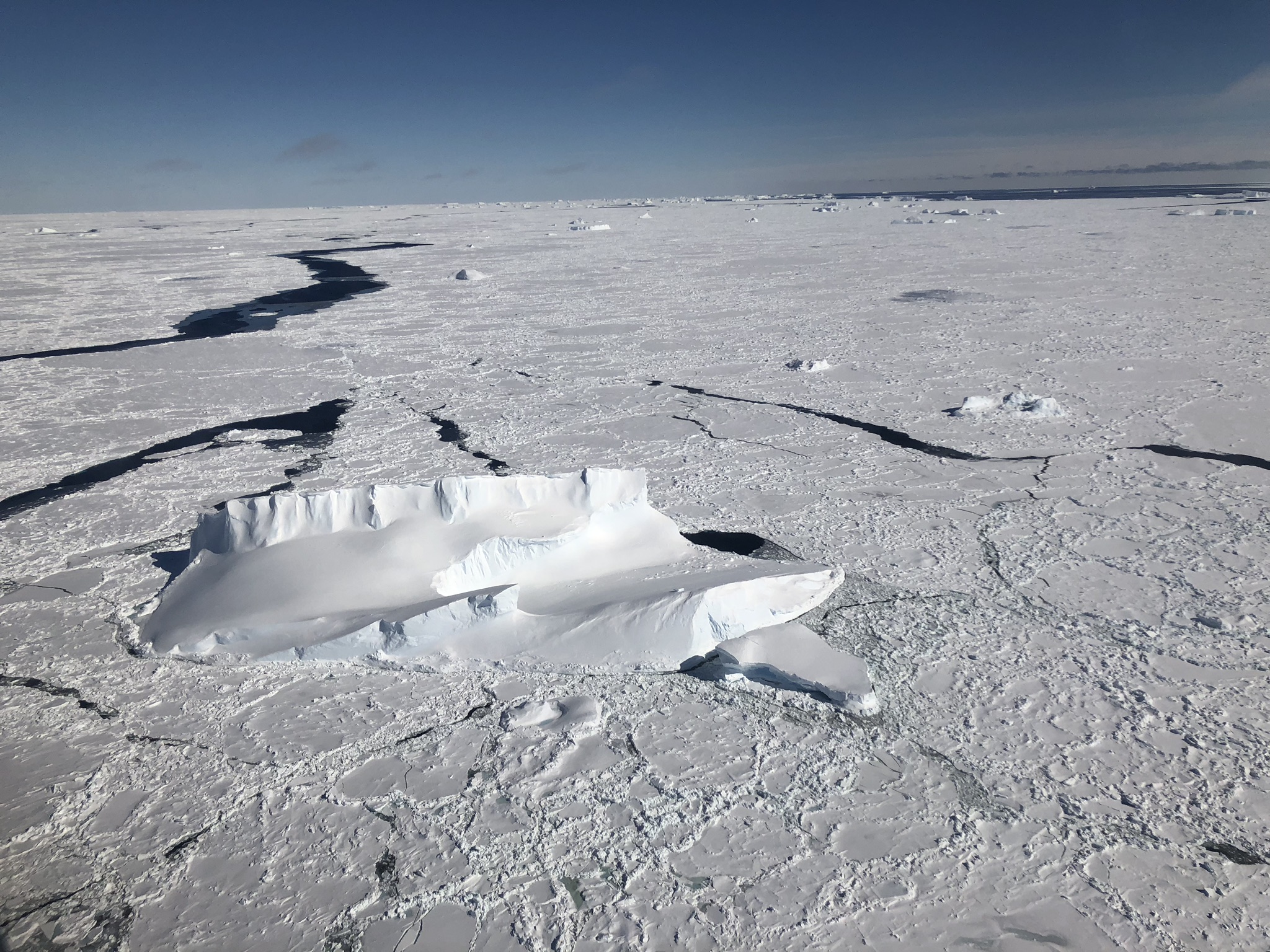
Then sea ice made an appearance. Icebergs were trapped at awkward angles in the frozen floes, and new ice spreading across open waters in translucent blues and whites—those had to be the most artistic formations, right? Maybe so—in my mind—until the next flight, which measured a newly created gigantic iceberg, and I glimpsed the jumble of bergy bits and sea ice in the rift between it and the glacier.
A glacier on the Antarctic Peninsula flows into the Bellingshausen Sea. Credits: NASA/Kate Ramsayer
At least I would be safe from a new favorite ice formation on my last flight, I thought. A survey farther inland of a region we had flown before, it should be old hat. But no. As we flew toward the site, the skies cleared over the Antarctic Peninsula, revealing glacier after glacier after glacier, all textbook examples of how spectacular glaciers can be.
Every day flying over Antarctica with the Operation IceBridge campaign brought a new incredible stretch of ice that left me, a new visitor to the continent, awestruck. Many members of the team have been surveying the continent for years, using a suite of instruments to map the ice and bedrock and monitor change. I couldn’t pick a favorite view, and can’t imagine they could either, so instead I just asked some of the IceBridge crew for an example of one of the neatest things they’ve seen flying over Antarctica.
Actually seeing Pine Island and Thwaites glaciers, which she has studied for more than a decade, is a highlight for Brooke Medley, IceBridge’s deputy project scientist. Her research showed that enough ice flows out of each glacier to contribute 1 millimeter to global sea level rise per decade. They’re massive glaciers, and flying over them puts into perspective just how massive they are. Credits: NASA/Kate RamsayerThe vastness of the Antarctic ice sheet can leave Eugenia DeMarco, IceBridge’s project manager, speechless. It’s just raw nature, she said, and provides a glimpse of what early explorers might have felt when they first ventured to this distant part of the world. Credits: NASA/Kate RamsayerIn massive ice streams that appear solid and unmoving, it’s the crevasses that remind you the ice is in motion, said Thorsten Markus, ICESat-2 project scientist. These giant breaks form as the faster ice downstream pulls away from the slower ice upstream. Credits: NASA/Brooke MedleyFrom above, crevasses can appear as wrinkles on fabric. Credits: NASA/Kate RamsayerThe ice may seem desolate, but there’s life in Antarctica, and Lyn Lohberger, an aircraft mechanic and safety technician, points to seals visible on the ice floes. They provide a contrast as well, he said—the black seals on the white ice, with blue seas and sky. Credits: NASA/Jeremy HarbeckIcebergs that have broken off of glaciers and ice shelves create different three-dimensional shapes in the flat sea ice, noted Victor Berger, with the CReSIS snow radar team. And Tim Moes, DC-8 project manager, pointed out the blue color of the older ice visible in the bergs. Credits: NASA/Kate RamsayerOperation IceBridge has surveyed Arctic and Antarctic ice for a decade, collecting scientific data on the changing ice. It’s the best office window view, said Jim Yungel, Airborne Topographic Mapper team lead—and it never gets old. Credits: NASA/Kate Ramsayer
The NASA DC-8 aircraft’s shadow is dwarfed in scale by the B-46 iceberg. Credits: NASA/Brooke Medley
by Kate Ramsayer / THE SKIES ABOVE ANTARCTICA /
The crack that would become B-46 was first noticed in September 2018 – and the berg broke the next month.
NASA’s Operation IceBridge flew over a new iceberg that is three times the size of Manhattan on Wednesday – the first known time anyone has laid eyes on the giant berg, dubbed B-46, that broke off from Pine Island Glacier in late October.
The flight over one of the fastest-retreating glaciers in Antarctica was part of IceBridge’s campaign to collect measurements of Earth’s changing polar regions. Surveys of Pine Island are one of the highest priority missions for IceBridge, in part because of the glacier’s significant impact on sea level rise.
On Wednesday, IceBridge’s approach to the iceberg began far above the glacier’s outlet, in the upper reaches of ice that will eventually flow into the glacier’s trunk. There, as far as the eye can see, it was flat and it was white.
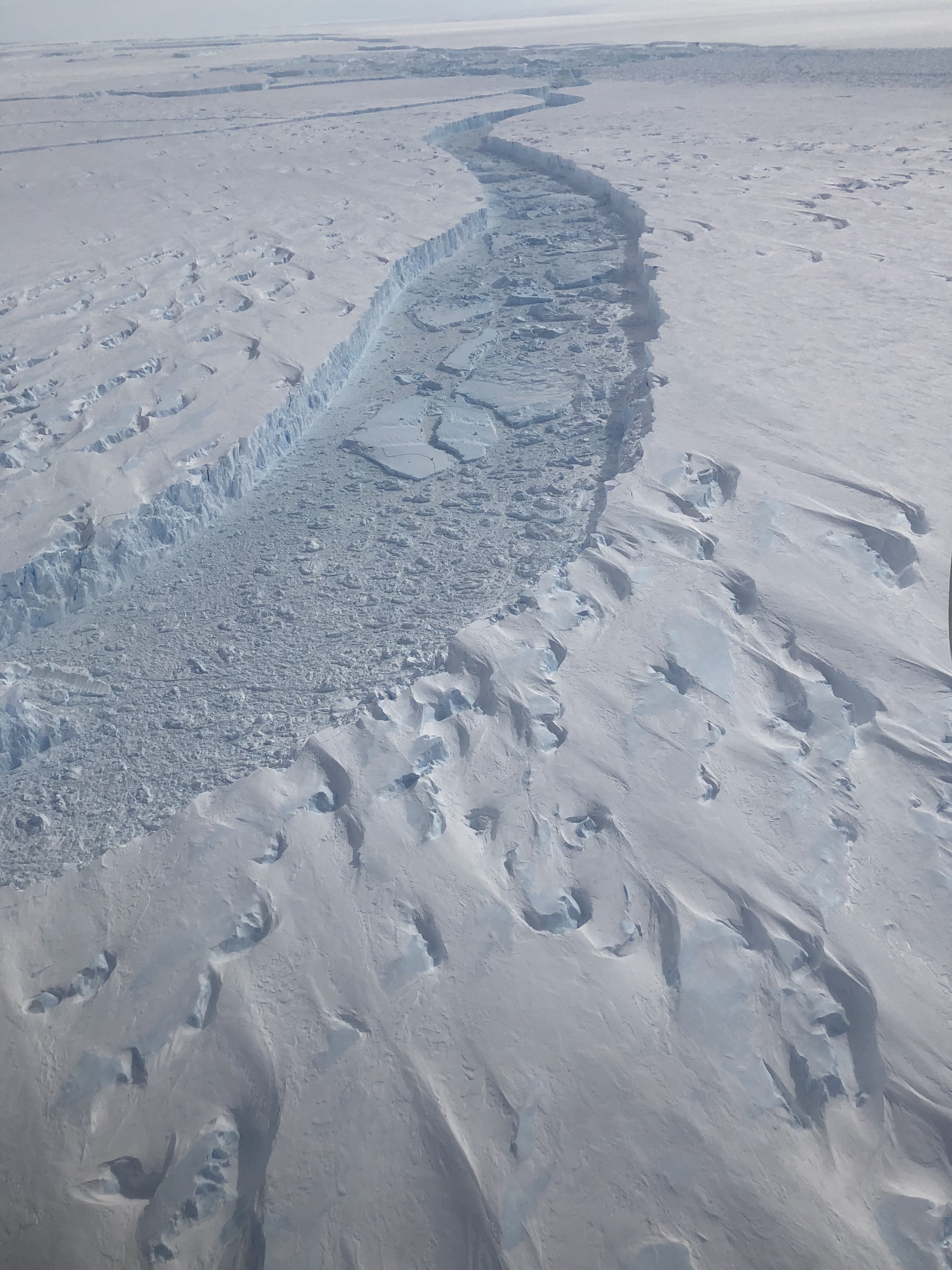
As the aircraft headed toward the glacier’s outlet in the Amundsen Sea, snow-covered crevasses became visible when sunlight struck at just the right angle. Every once in a while, a dark hole appeared in the crevasses where the snow had fallen through, providing a glimpse into the depths of the ice sheet. Then the holes got bigger.
The crevasses and dunes became a jumbled mess of ice, as Pine Island Glacier picks up speed as it flows to the sea. The crevasses got deeper and wider, swirling around each other. Striated snow layers in white and pale blue were visible down the crevasse walls, like an icy version of the slot canyons in the American West.
Crevasses in Pine Island Glacier indicate how fast the ice is moving. Credits: NASA/Kate RamsayerCrevasses in Pine Island Glacier get larger as the ice moves faster toward the Amundsen Sea. Credits: NASA/Kate Ramsayer
Then finally – the berg. Satellite imagery had revealed a massive calving event from Pine Island in late October, and the IceBridge crew was the first to lay eyes on the newly created iceberg.
The glacier ends in a sheer 60-meter cliff, dropping off into an ocean channel filled with a mix of bergy bits, snow, and newly forming sea ice. On the other side, a matching jagged cliff marked the beginning of B-46, as it stretched across the horizon.
The rift between Pine Island Glacier and a new giant iceberg, dubbed B-46, in Antarctica. Credits: NASA/Kate Ramsayer
“From this perspective at 1,500 feet, it’s actually really difficult to grasp the entire scale of what we just looked at,” said Brooke Medley, Operation IceBridge’s deputy project scientist who has studied Pine Island Glacier for 12 years. “It was absolutely stunning. It was spectacular and inspiring and humbling at the same time.”
Even though it had calved just over a week ago, the berg was already showing signs of wear and tear. Cracks wove through B-46, and upturned bergy bits floated in wide rifts. The iceberg will probably break down into smaller icebergs within a month or two, Medley said.
Iceberg calving is normal for glaciers – snow falls within the glacier’s catchment and slowly flows down into the main trunk, where the ice starts to flow faster. Eventually it encounters the ocean, is lifted afloat, and over time travels to the edge of the shelf. There, ice breaks off in the form of an iceberg. When the amount of snowfall and ice loss (from iceberg calving and melt) are the same, a glacier’s in balance. So it’s hard to link a particular iceberg like B-46 to the increasing ice loss from Pine Island Glacier.
A sheer wall of the new iceberg B-46 looms over a mix of sea ice, bergy bits, and snow at the base of Pine Island Glacier, as seen from a NASA Operation IceBridge flight on Nov. 7, 2018. Credits: NASA/Kate Ramsayer
But the frequency, speed, and size of the calving is something to keep an eye on, Medley said. In 2016, IceBridge saw a crack beginning across the base of Pine Island; it took a year for an actual rift to form and the iceberg to float away.
The crack that would become B-46 was first noticed in September 2018 – and the berg broke the next month.
They’re not the biggest glaciers on the planet, but Pine Island and its neighbor, Thwaites, have an oversized impact on sea level rise. Enough ice flows from each of these West Antarctic glaciers to raise sea levels by more than 1 millimeter per decade, according to a study led by Medley. And by the end of this century, that number is projected to at least triple.
“It’s deeply concerning,” Medley said. The geography of these glaciers make them highly susceptible to ice loss: relatively warm waters cut under the ice shelf, weakening it from below. This shock to the system has the capability to initiate an unstoppable retreat of these glaciers. There’s a reason Pine Island and Thwaites are dubbed the “weak underbelly” of Antarctica.
NASA has been monitoring Pine Island Glacier from aircraft since 2002, and IceBridge started taking extensive measurements of the fast-moving ice in 2009.
“Both Pine Island and Thwaites are ready to go and to take their neighboring glaciers with them,” Medley said. “Ice is getting sucked out into the ocean – and it’s hard to stop it.”
Satellite image of ocean color showing variations in phytoplankton biomass in the Northeast Pacific Ocean (cyan colored swirls). Station P is at the bottom of the image, hidden under the clouds. Credits: NASA
Adrian Marchetti is an associate professor in the department of Marine Sciences at the University of North Carolina at Chapel Hill and was aboard the R/V Roger Revelle for the EXPORTS field campaign this August and September.
So perhaps you read about the EXPORTS cruise and have heard about this place called Station P. You are now probably wondering why NASA would fund a mission that includes two research vessels spending over three weeks at this place? Well, to some, Station P (also known as Ocean Station Papa or P26) is simply a point on a map in the middle of the North Pacific Ocean – latitude 50 degrees north, longitude 145 degrees west. But to others it is much more than that.
Historically, in the 1950’s the Canadian weather service established a program to position ships off the west coast of Canada to forecast the incoming weather and sea state conditions. Station P was occupied for six weeks at a time by one of two alternating weather ships. Spending that much time at sea at one location can get, well, boring. To help pass the time, the crew collected samples and obtained measurements of the ocean. In the early days, these included bathythermograph casts that measured ocean temperatures at various depths. As more sophisticated approaches were developed to measure additional ocean properties, they started collecting samples for analysis of seawater chemistry (salinity, nutrient concentrations, etc.), chlorophyll concentrations (used as a proxy for phytoplankton biomass) and performed the occasional plankton haul to discover what critters called Station P their home.
A few decades later, with the development of new satellite technologies that enabled the monitoring of weather conditions from space (thanks NASA!), the weather ships became obsolete, and so the program was discontinued in the early 1980s. But as a result of the decades-long time series, what became apparent was the critical need for long-term monitoring of the ocean. So the Department of Fisheries and Oceans Canada established the Line P program made up of a transect where Station P is the endpoint. Today the Line P program is one of the longest ongoing oceanographic time series.
Map of the Line P transect, ending at Station P (also known as Ocean Station Papa or P26) in the Northeast Pacific Ocean. Credits: Karina Giesbrect.
So what’s so special about Station P? Well, this mostly depends on who you ask. For one, the North Pacific is one of the largest ocean basins. It undergoes periodic oscillations on approximately decadal timescales that can influence global climate. The North Pacific also represents the finish line of a long conveyer belt that transports deep waters from far-off regions of the planet to the surface.
From a biologist’s perspective (yes, I am a biological oceanographer), Station P also happens to reside in a so-called High Nutrient, Low Chlorophyll (HNLC) region where the growth of phytoplankton is limited by the availability of the micronutrient iron. This is a relatively new discovery, and although evidence for iron limitation in this region dates back to the early 1980s, the most compelling data was obtained in 2002 when Canadian scientists performed a large-scale iron fertilization experiment at Station P. The experiment was named the Subarctic Ecosystem Response to Iron Enrichment Study, or SERIES.
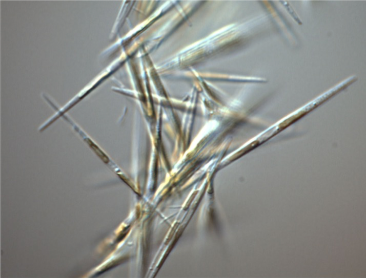
I participated in SERIES as a graduate student while completing my Ph.D at the University of British Columbia. My Ph.D. research focused on pennate diatoms (a type of phytoplankton) of the genus Pseudo-nitzschiathat that dominate iron-induced blooms in many HNLC regions across the globe .
Microscope image of the pennate diatom Pseudo-nitzschia granii. Diatoms like this one are common responders to iron enrichment in many iron-limited regions of the ocean, including Station P. Credits: Adrian Marchetti.
These particular diatoms can achieve rapid growth rates at iron concentrations that would leave their coastal counterparts fully anemic and left for dead. These oceanic diatoms have many adaptations to survive in low-iron waters and sometimes flourish when new inputs of iron, which are primarily from atmospheric dust, periodically enter the ocean. Prior to SERIES I joined a number of Line P cruises adding iron to diatoms in bottles to make them bloom. We now know that not all phytoplankton are created equal and, given their extensive diversity and important role in contributing to the planet’s carbon cycle, we need to keep studying them.
During the SERIES experiment we also created a massive bloom of diatoms (you guessed it, dominated by Pseudo-nitzschia) as a consequence of adding several tons of iron to an initial patch of seawater approximately 80 square kilometers in size. At the peak of the bloom, the patch had grown to a size of about 700 square kilometers, representing one of the largest experimental manipulations on the planet to date. Fortuitously, the patch was captured by a satellite image of ocean sea surface color at the peak of the bloom, the only such image obtained throughout the entire SERIES experiment. Indeed, the North Pacific Ocean is known for having dense cloud cover almost every day of the year.
Satellite image from July of 2002 showing surface chlorophyll concentrations in the North Pacific. Warmer colors indicate more chlorophyll. The arrow is pointing to the enhanced chlorophyll concentrations due to a diatom bloom that developed as a result of the SERIES iron enrichment at Station P. Data courtesy of NASA’s SeaWiFS Project. Credits: Institute of Ocean Sciences/Jim Gower
So this brings us back to EXPORTS, which marked my seventh trip to Station P, so I am beginning to feel quite at home there. With so many measurements obtained from Station P over the span of almost seven decades, what possibly is there left for us to learn? Well, to put it bluntly—lots! In my career I have been fortunate enough to participate on a number of field missions, and by far the EXPORTS program constitutes one of the most extensive scientific undertakings I have been part of. Although, this time we were not adding iron into the ocean but instead making observations of its natural state by following the same parcel of water that passed through Station P.
Scientists retrieve an instrument that collects ocean optical measurements while aboard the R/V Revelle during the EXPORTS cruise. These optical measurements are similar to those obtained from satellites in space. Credits: Adrian Marchetti
A primary objective of EXPORTS is to quantify the components of the ocean’s biological carbon pump, the process by which organic matter from the surface waters makes it’s way to ocean depths. Scientists aboard both ships measured the processes that constitute the initial formation of organic matter by phytoplankton all the way to its export from the upper ocean or it’s remineralization back into inorganic carbon.
UNC graduate student Weida Gong hard at work collecting phytoplankton on filters aboard the R/V Revelle during the EXPORTS cruise. Credits: Adrian Marchetti.
Bacteria or little animals known as zooplankton that feed on phytoplankton, bacteria, or other small animals perform both these processes. Other scientists were focused on measuring the fate of the carbon that does sink out of the upper ocean by looking at the overall amount and what forms these sinking particles take. It was quite an undertaking that had a lot of moving parts, all happening on two moving ships.
There was also a large effort to obtain as much information about this region using a multitude of underway systems that includes mass spectrometers, particle imaging “cytobots” and flow cytometers, autonomous instruments that includes gliders, floats and wire walkers, and instruments that collect optical measurements. Although we may consider ourselves lucky if we are able to obtain more than a handful of satellite images of ocean properties from space, we are making similar measurements from ships. We are also making new measurements that do not currently exist on satellites but perhaps will one day so that we can continue to develop new ways of monitoring our precious planet from above.
Through the years we have learned a lot about how this part of the ocean operates, yet there is still so much more for us to learn. This is especially important at this period in Earth’s history as we continue to place considerable pressures on our valuable ocean resources.
And as for that postcard, well lets just say that it’s in the mail.
by Kate Ramsayer / 20,000 FEET ABOVE THE SOUTH POLE /
This was my first flight over Antarctica, and the vast expanse of ice – just white on the ground and blue in the sky as far as the eye can see – took my breath away.
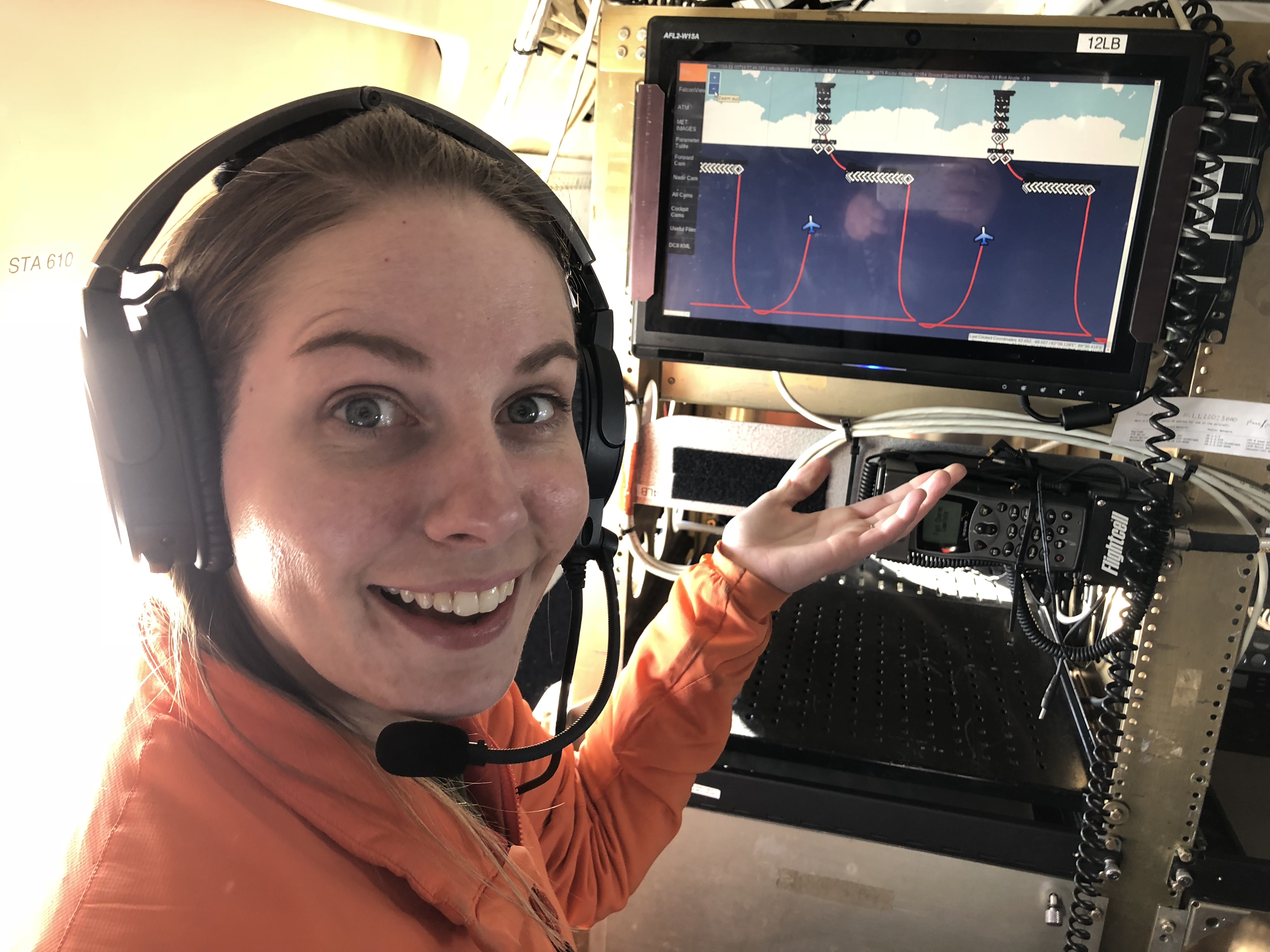
As Operation IceBridge flew directly over the South Pole, my eyes went to the updating flight map. We were already off the edge of the map, as our survey line along 88 degrees south latitude had dropped below the extent of the Mercator projection. And now, as the latitude indicator counted up to 90 degrees and the crew counted down the seconds, I watched as our flight path showed the plane completely reversing course midair and looping up north. Of course, (and fortunately for my stomach) our actual DC-8 aircraft kept in a straight line.
OIB Deputy Project Scientist Brooke Medley shows the weird flight map path that results from flying around, then over, the South Pole. Credits: NASA/Kate RamsayerThe Continuous Airborne Mapping By Optical Translator (CAMBOT) system images the Amundsen-Scott South Pole station as NASA’s DC-8 flying laboratory ascends after completing a survey line. Credits: NASA/Matt Linkswiler
Navigating can be tricky at the end of the world. While the mapping software went out of whack crossing over the pole, the actual flight software didn’t miss a beat – IceBridge Mission Scientist John Sonntag programmed it that way, knowing the ice-monitoring flights would need to handle the situation.
And although Halloween was last week, Saturday’s flight called for another trick – fooling the plane into flying a smooth arc around the 88 south line of latitude.
“Basically, we hack the autopilot,” Sonntag said. “We make the aircraft think that it’s lining up on a runway in bad weather, and the pilots can’t see. But what we’re really doing is lining it up on a data collection line, and doing it very precisely.”
West Antarctic mountains, on the way to the South Pole. (NASA/Kate Ramsayer)
He developed this system to deal with a quirk of flying at such a high latitude. If a plane is flying at the equator and wanted to go east, it would just go straight. But to go due east along the 88 south latitude line, the plane has to actually turn to the right a bit. If we wanted to circle the pole at 89 degrees latitude, we’d have to turn right even more.
Typical navigation procedures involve flying the shortest path between two points (known as a “great circle” path), where the aircraft’s heading varies continually to keep it on the flight path. But this far south, that would create a scalloped flight path: not efficient for the plane nor optimal for the instruments onboard, and – again – not friendly to my stomach. So Sonntag designed an autopilot system that can fly a perfect, smooth arc around the pole, along a mathematical concept called a loxodrome.
“I’m half engineer and half scientist, and this flight brings out the engineer nerd in me – I love this stuff,” Sonntag said. “Then seeing this in use, flying a 350,000-pound airplane around the South Pole – I mean, it’s nerd heaven.”
Sastrugi are fragile shapes on top of snow that are formed by winds. Sastrugi near the South Pole suggest there are two dominant wind directions. Credits: NASA/Brooke Medley
It was nerd heaven for me as well, but for different reasons. This was my first flight over Antarctica, and the vast expanse of ice – just white on the ground and blue in the sky as far as the eye can see – took my breath away.
This particular survey route isn’t a favorite with the regular crew. There’s none of the dramatic mountains of the coastal glaciers, or icebergs calving into sea ice. But I loved seeing the repeating kaleidoscope patterns of the ice dunes called sastrugi (a favorite word AND a favorite ice formation, all in one!). From 1,500 feet up, it’s almost impossible to gauge how high they are, but it’s an incredible texture in this bleak, bright expanse of ice.
And this was a key flight for another reason: I’ve been writing for the ICESat-2 mission for more than five years, and in September I watched as it launched into orbit. ICESat-2 uses a laser instrument to measure the height and focuses on the polar regions. All of its orbits cross the globe at – you guessed it – 88 south latitude. So by flying this route a third of the way around the 88 south latitude circle, IceBridge is taking measurements that will help check a third of ICESat-2’s orbits.
The ATLAS lidar on ICESat-2 uses three pairs of laser beams to measure Earth’s elevation and elevation change. As a global mission, ICESat-2 collects data over the entire globe. However the ATLAS instrument is optimized to measure land ice and sea ice elevation in the polar regions, as is shown by this graphic representation of its orbital path around the South Pole. Credits: NASA
That means the satellite instrument I saw years ago when it was just an empty box in a cleanroom flew over that stretch of ice we measured 16 times, taking 60,000 height measurements each second. From 300 miles up, it measured the height of my new favorite sastrugi.