Page MenuHomePhabricator

Support WMF communities in run-up to switching EditPage over to OOUI
Closed, ResolvedPublic8 Estimated Story Points

Authored By
Jdforrester-WMF
Apr 12 2017, 11:20 PM
Referenced Files
F10127539: Snímek z 2017-10-11 00-28-30.png
Oct 10 2017, 10:29 PM
F10120302: Screen Shot 2017-10-10 at 08.56.46.png
Oct 10 2017, 3:57 PM
F8858673: Selection_004.png
Jul 26 2017, 8:09 PM
F8795355: Snímek z 2017-07-19 03-10-22.png
Jul 19 2017, 1:13 AM
F8794354: Snímek z 2017-07-18 20-21-29.png
Jul 18 2017, 6:22 PM
F8776271: Snímek z 2017-07-16 18-43-44.png
Jul 16 2017, 4:48 PM
F8776273: Snímek z 2017-07-16 18-43-31.png
Jul 16 2017, 4:48 PM
F8697907: 20170711-enwiki-edit-ooui-monobook.png
Jul 11 2017, 12:06 AM
Tokens
"Like" token, awarded by Qgil."Love" token, awarded by Shizhao."Love" token, awarded by Liuxinyu970226."Like" token, awarded by TerraCodes."Love" token, awarded by Ladsgroup."Haypence" token, awarded by RandomDSdevel."Love" token, awarded by Iniquity.

Description

The buttons underneath the wikitext editor (Publish changes, Show preview and Show changes) will change. They will fit in with the OOUI look that is replacing the old design for all of MediaWiki.

User typeBeforeAfter (still showing Save changes button label instead of Publish changes)
Logged-out
edit-no-ooui-logged-out.png (185×1 px, 16 KB)
edit-with-ooui-logged-out.png (203×1 px, 16 KB)
Logged-in
edit-no-ooui-logged-in.png (223×1 px, 19 KB)
edit-with-ooui-logged-in.png (238×1 px, 16 KB)

This change was made in MediaWiki in T111088, and is now ready for deployment to Wikimedia wikis.

How you can help

Related Objects

Event Timeline

There are a very large number of changes, so older changes are hidden. Show Older Changes

I know this might be time-consuming, but please consider expanding the section 'Why'. Users should understand the reasons not only for this small change, but for the direction of changes as well. They should understand your motivation. Lately, I've been receiving some extremely negative feedback on this. The problem isn't mainly about the color or shape (experienced users have been editing despite of our UX), but about a lack of user-friendly explanation for any related change.

Therefore: please use simple, straightforward words, no hashtag-like expert terms. Give details. Don't assume that people skilled at writing encyclopedias know IT. Attention, I'm going to act like a devil's advocate:

  • Accessibility - how this helps us to be more accessible? can blind people see big blue buttons better? does this make our devices faster?
  • Internal consistency of the user experience - what does 'user experience' mean? why should we care? why can't it stay inconsistent? who benefits from that?
  • Code development and maintenance - is the current one difficult? how much? for whom? why should we care? why can't it stay as it is?
  • What is OOjs UI? why do we need this? why does an encyclopedia/a dictionary/etc. need this?

When the answers are published, your decisions will be defendable more easily and effectively, and you'll avoid another bad reception.

I hope it's helpful :)

It's a wiki, and you are all welcome to improve the page. The worst-case scenario is that I'll revert you. ;-)

@matmarex if you don't like the location of the page, then you should feel free to move it. I'd prefer that it stayed at mw.org (rather than Meta), since it's fundamentally a technical project. You might consider using a naming convention similar to https://www.mediawiki.org/wiki/Contributors/Projects/Columns_for_references (as one option).

Thank you, but I don't know the answers to many of those questions. :) I might guess, interpret, post sth on a personal blog, but I'm not competent to write anything on the behalf of the Prod... Audiences department. I'm a Wikipedian and I can help to communicate your answers to the communities.

Note, it isn't a personal request to Whatamidoing. The answers can be published by anyone professional/competent (maybe also responsible).

I think we forgot to test this in monobook...

Screen Shot 2017-06-12 at 22.09.40.png (394×2 px, 77 KB)
Screen Shot 2017-06-12 at 22.08.49.png (490×2 px, 121 KB)

There is a significant margin-top on those inline checkboxes for some reason.

Screenshot of mediawiki.org btw.

I definitely didn't forget to test it on MonoBook. That must be a new issue. I'll look into it later.

Change 359514 had a related patch set uploaded (by Jforrester; owner: Jforrester):
[operations/mediawiki-config@master] Enable OOjs UI buttons on EditPage for plwiki

https://gerrit.wikimedia.org/r/359514

Change 359514 merged by jenkins-bot:
[operations/mediawiki-config@master] Enable OOjs UI buttons on EditPage for plwiki

https://gerrit.wikimedia.org/r/359514

Mentioned in SAL (#wikimedia-operations) [2017-06-19T13:21:08Z] <hashar@tin> Synchronized wmf-config/InitialiseSettings.php: Enable OOjs UI buttons on EditPage for plwiki - T162849 (duration: 00m 42s)

Change 360370 had a related patch set uploaded (by Jforrester; owner: Jforrester):
[operations/mediawiki-config@master] Enable OOjs UI EditPage buttons on es/fr/it/ja/ru-wiki

https://gerrit.wikimedia.org/r/360370

Change 360371 had a related patch set uploaded (by Jforrester; owner: Jforrester):
[operations/mediawiki-config@master] Enable OOjs UI EditPage buttons on all Wikipedias

https://gerrit.wikimedia.org/r/360371

The deployment to the Polish Wikipedia found some small-ish bugs, but it seems to have mostly gone smoothly so far. (I speak under correction.)

Next up are the French, Spanish, Japanese, Russian, and Italian Wikipedias and Meta, which I've scheduled for Wednesday, 5 July 2017. The Portuguese Wikipedia (and/or any other site) is welcome to volunteer for this first group.

Change 360370 merged by jenkins-bot:
[operations/mediawiki-config@master] Enable OOjs UI EditPage buttons on es/fr/it/ja/ru-wiki and meta

https://gerrit.wikimedia.org/r/360370

Right of the bat: red "Cancel" draws too much attention, OOjs UI really should’ve not change the default behaviour of quiet buttons (mw-ui-quiet) from original MediaWiki UI where they were blue/green/red only on hover. I think this is a very major flaw of new design. It was not noticeable when this feature was available only via URL parameter, but it is more prominent issue now.

See the discussion starting from here, T111088#3023190 TLDR: It's a UX decision to make people aware that this button exist (and it's useful to them)

See the discussion starting from here, T111088#3023190 TLDR: It's a UX decision to make people aware that this button exist (and it's useful to them)

Well, this is disappointing. It looks like a red link (which is a big ‘no’ against any red quiet buttons) and it draws too much attention to the element which is not the most useful in the form. This should've been somehow evaluated before the deploy, IMO.

Just to point out the new summary input sometimes feels really laggy on my gipsy computer.

Have you noticed how many callbacks there are on this input??

It looks like a red link (which is a big ‘no’ against any red quiet buttons)

Agreed. You can reopen T165122 and add your comments there.

Another annoying regression after converting to OOjs UI: selected suggestions for ‘Preview page with this template/module’ can’t be autocompleted by going through the list, although in previous version this worked absolutely fine. Maybe we can at least disable it for TemplateSandbox gadget until this is fully resolved?

Edit: sorry for misinforming.

Whatamidoing-WMF raised the priority of this task from Medium to High.Jul 10 2017, 6:08 PM

Under Monobook still no progress...

  • no OOjs UI "accessible" styling of inputs (standard tiny checkboxes)
  • strange bathroom-green gradient publish button, inconsistent with blue-gray skin visual
  • large vertical indent between summary and checkboxes

20170711-enwiki-edit-ooui-monobook.png (226×1 px, 6 KB)
(2017-07-11 snapshot from enwiki using &ooui=1&useskin=monobook flags)

Any plans to make the look&feel more consistent between Monobook and Vector?

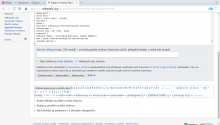
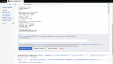
Text above edit summary on cswiki (Czech Wikipedia) is wrapped unnecessarily. Compare following screenshots:

oldnew
Snímek z 2017-07-16 18-43-44.png (741×1 px, 145 KB)
Snímek z 2017-07-16 18-43-31.png (741×1 px, 137 KB)

@Teslaton, I can't reproduce the gap between the edit summary and the tick boxes. (MonoBook is not meant to look like Vector.)

@Dvorapa, I can't reproduce that. Would you please check and see whether it's been fixed for you?

@Whatamidoing-WMF No, it is still wrapped.

Screen resolution: 1366x768; maximized window size: 1299x741; OS: Linux; DE: Gnome

Dvorapa, would you check to make sure that it's wrapping for you in a private/logged-out/incognito window? (Anyone else who's checking: You have to check this at cswiki, with &uselang=cs, because there's a lengthy custom message there instead of the regular label.)

@Whatamidoing-WMF I don't expect them to look the same. What I do expect, is that the accessibility aspects (sizes and contrasts of relevant widgets, in this case) would get improved in the same way, regardless of a skin. Otherwise, there is no real benefit of change like this for non-vector users.

The gap seems to be reduced by ~16px in the current release (enwiki). Indents are still a bit larger than in ooui=0 mode, but that may be intentional.
https://en.wikipedia.org/w/index.php?title=User:Teslaton/Test&action=edit&ooui=0&useskin=monobook
https://en.wikipedia.org/w/index.php?title=User:Teslaton/Test&action=edit&ooui=1&useskin=monobook

@Whatamidoing-WMF I don't expect them to look the same. What I do expect, is that the accessibility aspects (sizes and contrasts of relevant widgets, in this case) would get improved in the same way, regardless of a skin. Otherwise, there is no real benefit of change like this for non-vector users.

Yes, you're right, the interface for Monobook does not have many of the accessibility improvements we're bringing to users. This is intentional prioritisation for the billion users of Vector (as the default skin on Wikimedia wikis) against the thousands of users of Monobook (which isn't). We will continue to address accessibility issues for all users, including for Monobook users, but there is less benefit for you right now, I agree.

Not logged in, private browser window:

Snímek z 2017-07-18 20-21-29.png (741×1 px, 142 KB)

This looks like the fundamental sizing bug in Linux's font manager that we keep having users run into (where fonts are rendered ~10%+ larger in some distros Linux than Windows/Mac/Android/iOS), but I'm not sure why it's triggering in one mode and not the other.

This is intentional prioritisation for the billion users of Vector (as the default skin on Wikimedia wikis) against the thousands of users of Monobook (which isn't).

I can understand the reasoning, but I don't see the significance of Monobook to be that marginal:

  1. according to https://en.wikipedia.org/wiki/Wikipedia:Database_reports/User_preferences#Skin (2015), Monobook usage was quite far from "thousands" (2,182,546 is 22% of the total of 9,865,515, although there's no details of the metric used).
  2. Wikipedia "power users" seem to be quite biased towards using (or keeping use of) Monobook. On our wiki (skwiki), as far as I know from discussions, the majority of long-term active editors still do prefer Monobook. The following statistics is from 2013, but the preference of Monobook among power users was >60% at the time: https://meta.wikimedia.org/wiki/Turning_off_outdated_skins/stats#Global_skin_usage

I can understand the reasoning, but I don't see the significance of Monobook to be that marginal:
...

Well, it still is not part of the same task since IIRC Monobook uses a different theme for UI elements (Apex) and it is not fully compatible with OOUI. The reasonable thing to do is to drop Apex theme in favour of OOUI for all skins, but it probably requires global changes that go beyond the scale of this particular improvement (and this task).

Change 360371 merged by jenkins-bot:
[operations/mediawiki-config@master] Enable OOjs UI EditPage buttons on all Wikipedias

https://gerrit.wikimedia.org/r/360371

Mentioned in SAL (#wikimedia-operations) [2017-07-18T23:22:27Z] <thcipriani@tin> Synchronized wmf-config/InitialiseSettings.php: SWAT: [[gerrit:360371|Enable OOjs UI EditPage buttons on all Wikipedias]] T162849 (duration: 00m 47s)

What a coincidence, I was just about to report the exact same issue for French Wikipedia.

It's present since the beginning of the switch to OOui, and indeed it is caused by this max-width:50em CSS.
Although the issue is cosmetic, it should be fixed as it is an unexpectedly inherited property.

An override rule such as #wpSummaryLabel .oo-ui-fieldLayout-header { max-width: none; } should be added.

If you're talking about the width of the edit summary field, that has not significantly changed (a few pixels) – it's been 80% width for a while now, but I agree that it should take the full width instead. However, this isn't the right venue for that discussion, as it's unrelated.

@Jdforrester-WMF We are talking about the width of its label, which is even shorter than the summary field and it looks broken on cswiki and frwiki (at least)

@Jdforrester-WMF We are talking about the width of its label, which is even shorter than the summary field and it looks broken on cswiki and frwiki (at least)

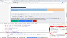
Example links and screenshot:

Screenshot (before and after) confirming that turning off that CSS rule does fix it:

Selection_004.png (495×1 px, 83 KB)

Status updates:

  • T169982 was temporarily worked around by hiding the feature; a fix is complete and will be released in next week's deployment, along with the feature re-enabled.
  • T171156 needs the fix being finished, which should happen for next week's deployment.
  • T171022 is a bug in Firefox we're going to ask upstream to fix. I'm removing it as a blocker to this feature.
  • T171495 is a report from one user, which cannot currently be replicated. I'm removing it as a blocker to this feature.

The dropdown options are insanely too spaced.
i.e. the vertical padding for .oo-ui-dropdownInputWidget option

For example, the dropdown for selecting a reason when deleting a page.

It's so large it even saturates my 1920x1080 screen, and the lines are so spaced they are painful to visually crawl.

The summary label is broken again since yesterday:

Text above edit summary on cswiki (Czech Wikipedia) is wrapped unnecessarily. Compare following screenshots:

oldnew
Snímek z 2017-07-16 18-43-44.png (741×1 px, 145 KB)
Snímek z 2017-07-16 18-43-31.png (741×1 px, 137 KB)

The summary label is broken again since yesterday:

Text above edit summary on cswiki (Czech Wikipedia) is wrapped unnecessarily. Compare following screenshots:

oldnew
Snímek z 2017-07-16 18-43-44.png (741×1 px, 145 KB)
Snímek z 2017-07-16 18-43-31.png (741×1 px, 137 KB)

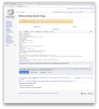
Seems fine to me (also in Opera):

Screen Shot 2017-10-10 at 08.56.46.png (1×1 px, 375 KB)

Do you have a user script or gadget breaking it for other tools? The screenshot you've supplied as "new" seems to include the 80% width restriction I got rid of in July, for instance. Maybe a script is trying to re-write it?

I've tried French Wikipedia, where the label is much longer and where I do have only default gadgets, scripts and preferences enabled, nothing more (I don't edit on frwiki) and it looks like this problem, fixed in July, is back somehow. I moved to Firefox currently, but I can test in Opera too if needed.

I don't see the issue either. Can you take and upload another screenshot of what you're seeing now? Perhaps there's some subtle difference that would make the issue obvious to us.

Logged out, Opera 48, Arch linux + Gnome 3.26:

Snímek z 2017-10-11 00-28-30.png (741×1 px, 205 KB)

Screen resolution: 1366x768; maximized window size: 1299x741

Caused by max-width: 50em, it really looks as if the former bug fix was reverted

Huh, indeed. The font my system ends up using is narrow enough for the issue not to be visible on cs.wp, but I can reproduce locally after making the text long enough. (Note that the edit summary field's width is not limited; only the label's width is.) It's weird if this changed now, I'm pretty sure we've not changed anything relevant to this. Should be easy to fix though.

Change 383592 had a related patch set uploaded (by Bartosz Dziewoński; owner: Bartosz Dziewoński):
[mediawiki/core@master] mw.action.edit.styles: Remove max-width on edit summary field's label too

https://gerrit.wikimedia.org/r/383592

I've read older comments on this task again and it seems you pointed this out multiple times, and we apparently misunderstood you and thought the problem was with the edit summary field only rather than also its label. Sorry. The fix will be deployed to all wikis per the usual schedule next week (17-19 October).

Change 383592 merged by jenkins-bot:
[mediawiki/core@master] mw.action.edit.styles: Remove max-width on edit summary field's label too

https://gerrit.wikimedia.org/r/383592

@matmarex I see, but it was fixed for a while and broke lately again. Thank you