before_after 3.2.0  before_after: ^3.2.0 copied to clipboard
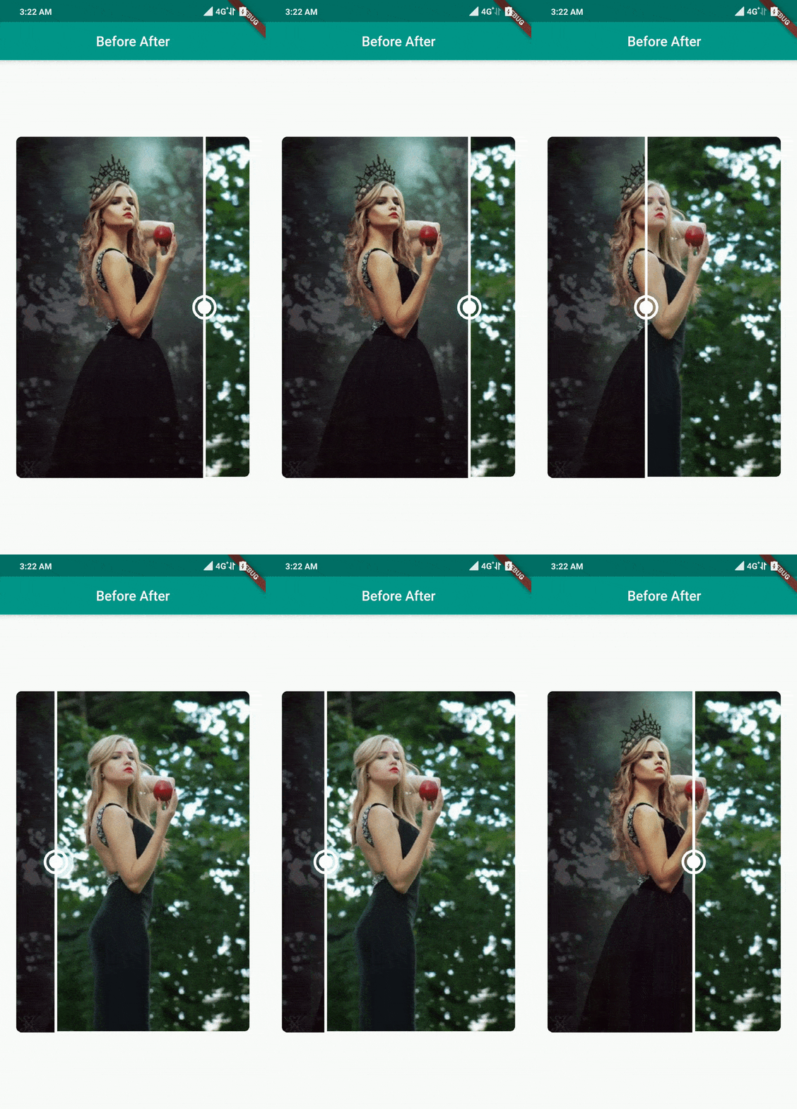
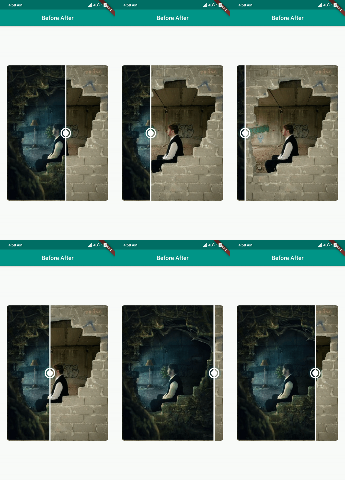
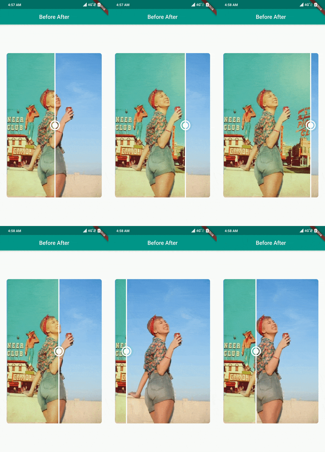
A flutter package which makes it easier to display the difference between two images.
👏 Before After 


 #
#

A flutter package which makes it easier to display the differences between two images..
The source code is 100% Dart, and everything resides in the /lib folder.
Live Demo: https://xsahil03x.github.io/before_after
Show some ❤️ and star the repo to support the project #
🔅 Gifs #
 |
 |
 |
💻 Installation #
In the dependencies: section of your pubspec.yaml, add the following line:
dependencies:
  before_after: <latest version>
❔ Usage #
Import this class #
import 'package:before_after/before_after.dart';
before after #
BeforeAfter(
  value: value,
  before: Image.asset('assets/after.png'),
  after: Image.asset('assets/before.png'),
  onValueChanged: (value) {
    setState(() => this.value = value);
  },
)
🎨 Customization and Attributes #
| Field | Type | Description |
|---|---|---|
| before | Widget | The widget to be displayed before the slider. |
| after | Widget | The widget to be displayed after the slider. |
| direction | SliderDirection | The drag direction of the slider. |
| height | double? | The height of the BeforeAfter widget. |
| width | double? | The width of the BeforeAfter widget. |
| trackWidth | double? | The width of the slider track. |
| trackColor | Color? | The color of the slider track. |
| hideThumb | bool | Whether to hide the slider thumb. |
| thumbHeight | double? | The height of the slider thumb. |
| thumbWidth | double? | The width of the slider thumb. |
| thumbColor | Color? | The color of the slider thumb. |
| overlayColor | MaterialStateProperty<Color?>? | The highlight color that's typically used to indicate that the slider thumb is focused. |
| thumbDecoration | BoxDecoration? | The decoration of the slider thumb. |
| divisions | int? | The number of discrete divisions on the slider. |
| value | double | The position of the slider, ranging from 0.0 to 1.0. |
| onValueChanged | ValueChanged | A callback function that is called when the value of the slider changes. |
| thumbDivisions | int? | The number of discrete divisions on the slider thumb. |
| thumbPosition | double | The position of the slider thumb, ranging from 0.0 to 1.0. |
| onThumbPositionChanged | ValueChanged | A callback function that is called when the position of the thumb changes. |
| focusNode | FocusNode? | The focus node for the widget. |
| autofocus | bool | Whether the widget should be focused automatically. |
| mouseCursor | MouseCursor? | The cursor for a mouse pointer when it enters or hovers over the widget. |
