About screenshots in GitHub Docs
There are positives and negatives to adding a screenshot. Screenshots make articles more visually scannable and make instructions easier to understand, especially for people who have difficulty reading. When supplied with alt text, screenshots help blind and low-vision users collaborate with sighted colleagues.
On the other hand, screenshots privilege sighted users, add length and load time to articles, and increase the volume of content that needs to be maintained. When captured at different pixel dimensions and degrees of zoom than the reader is using, screenshots can be confusing.
Therefore, we only add screenshots to GitHub Docs when they meet our criteria for inclusion.
Criteria for including a screenshot
Use a screenshot to complement text instructions when an element of the user interface (UI) is hard to find:
- The element is small or visually subtle.
- The element is not immediately visible. For example, the element is contained in a dropdown menu.
- The interface has multiple competing choices that can cause confusion.
Do not use screenshots for procedural steps where text alone is clear, or to show code commands or outputs.
Examples of the criteria for inclusion
To help you determine whether to add a specific screenshot, consider the following examples of screenshots that do and do not meet our criteria for inclusion.
Screenshots that meet the criteria
The following screenshots do meet our criteria for inclusion.
The UI element is small or visually subtle
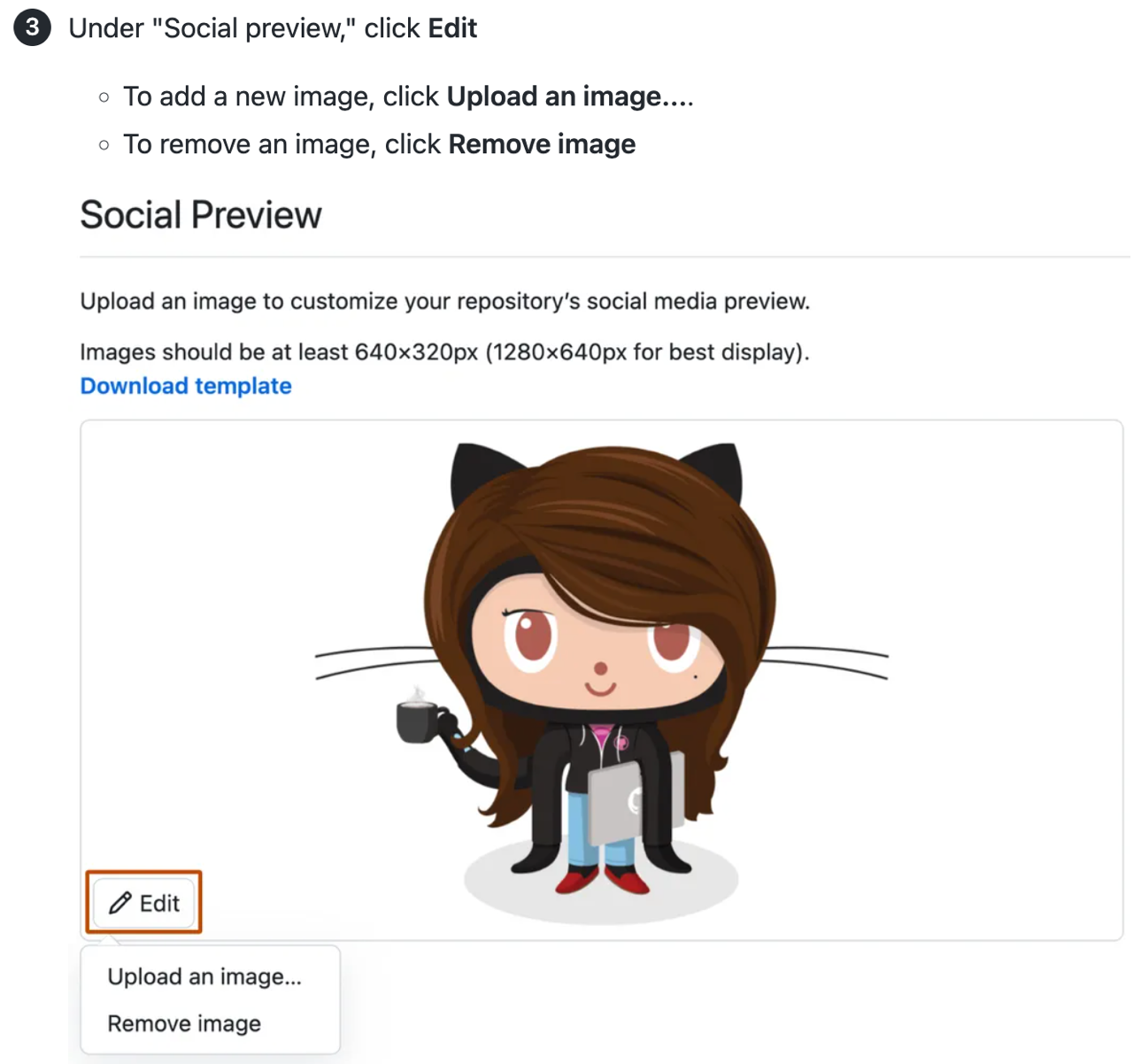
The edit button for a repository's social media preview image is small and visually unobtrusive. It may be hard to find among the other repository settings.

The screenshot also gives a visual reference for the aspect ratio required.
The UI element is not immediately visible
Options to clone a gist are contained under a dropdown menu labeled "Embed."

The screenshot is helpful to locate the correct option in the menu, which is not visible until the dropdown is opened.
The interface has multiple choices that can cause confusion
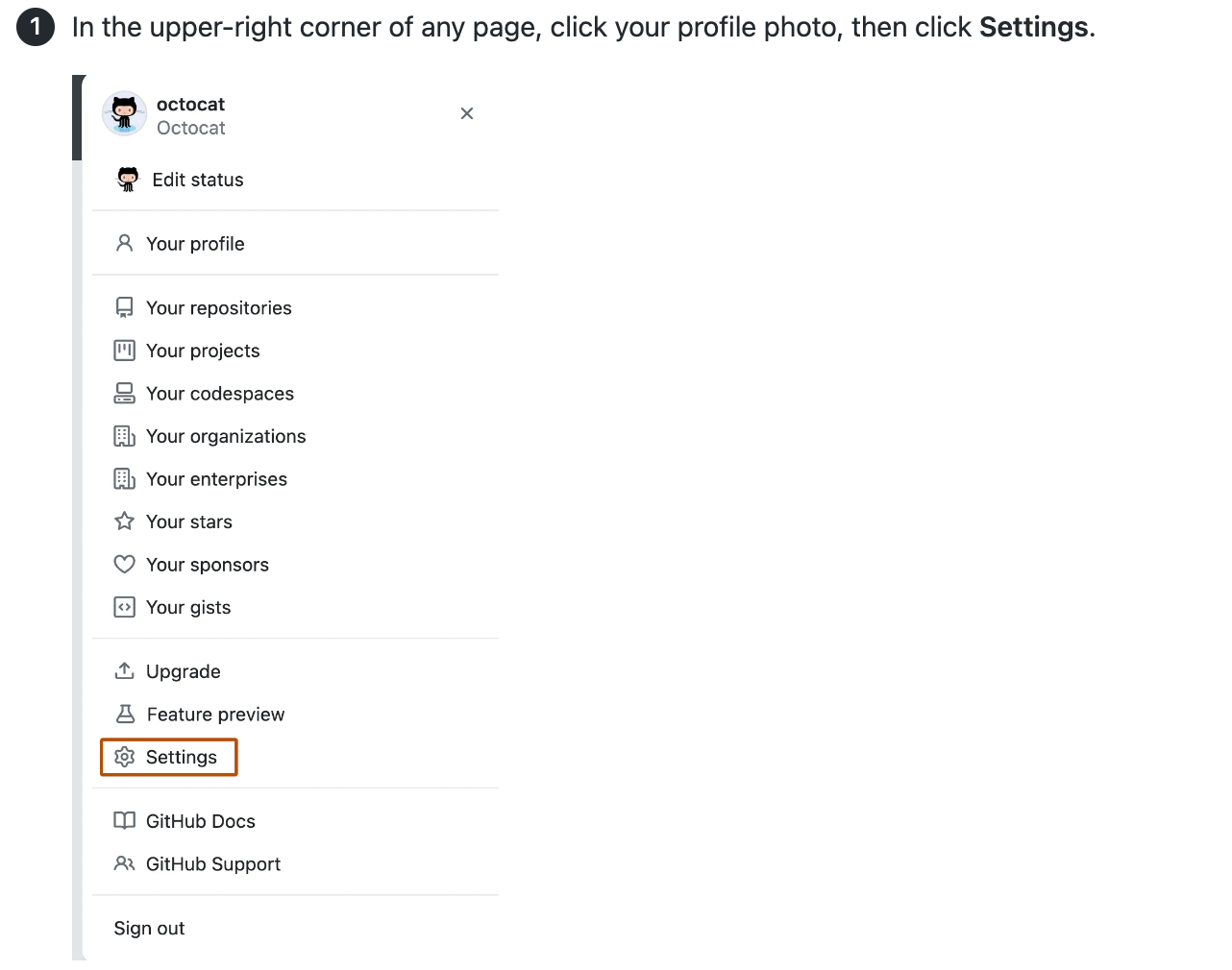
There are three elements that could be interpreted as "settings" on the main page for a repository: the "Settings" tab, the gear icon in the "About" section of the right sidebar, and the account settings accessed via the profile picture.

The screenshot is helpful to find the correct option.
Screenshots that do not meet the criteria
The following screenshots do not meet our criteria for inclusion.
The UI element is easy to find
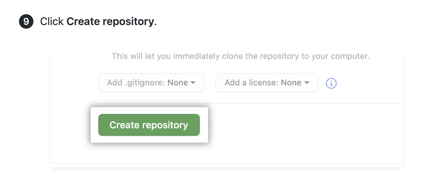
The "Create repository" button is visually prominent through size, color, and placement. There are few competing choices.

Text instructions are adequate to help the user complete the step.
The UI has few, straightforward choices
Simple and straightforward options, such as selecting or deselecting a checkbox, do not need a visual support.

Text instructions are adequate to help the user complete the step.
There are also two accessibility implications of including the full sentence of text below the checkbox in the screenshot:
- The sentence is hard to read for low-sighted users, because it's small and not as crisp as HTML text.
- A person using a screen reader won't have access to the information, because it will not fit within alt text character limits. Including the text in the instructions would remedy this, but would be unnecessarily wordy.
Requirements for screenshots
In addition to the criteria for inclusion, screenshots must meet the following requirements.
Technical specifications
- PNG file format
- Static images only (no GIFs)
- 144 dpi
- 750–1000 pixels wide for full-column images
- File size of 250 KB or less
- Descriptive file names, such as
gist-embed-link.pnginstead ofright_side_page_03.png
Accessibility
To meet the needs of more users, screenshots must:
- Be accompanied by complete instructions in the procedural step, with no information conveyed entirely in visual form.
- Be full contrast, as in the interface itself, with nothing obscured or reduced in opacity or color contrast.
- Have alt text that describes the content of the image and the appearance of its highlighting, if any. For more information, see "Style guide."
- Be clear and crisp, with text and UI elements as legible as possible.
Visual style
- Show a UI element with just enough surrounding context to help people know where to find the element on their screen.
- Reduce negative space by resizing your browser window until optimal.
- Show interfaces in light theme wherever possible.
- For GitHub, select "Light default" in your appearance settings. For more information, see "Managing your theme settings."
- For VSCode, select "GitHub light default" in the free GitHub Theme extension.
- If the software you need to screenshot is available in dark mode only, it's fine to use dark mode.
- If your username and avatar appear, replace them with @octocat's username and avatar. Use the developer tools in your browser to replace your username with
@octocatand to replace the URL of your avatar withhttps://avatars.githubusercontent.com/u/583231?v=4. - Do not include a cursor.
Visual style for dropdown menus
If the primary goal in showing a dropdown menu is to help the reader locate the menu itself, show the menu closed.

If the primary goal in showing a dropdown menu is to help the reader distinguish among options within the menu, show the menu open. Capture open menus without focus (cursor or hover state). Showing menu items with a white background ensures contrast with the dark orange outline, where present.

Highlighting elements in screenshots
To highlight a specific UI element in a screenshot, use our special theme for Snagit to apply a contrasting stroke around the element.
The stroke is the color fg.severe in the Primer Design System (HEX #BC4C00 or RGB 188, 76, 0). This dark orange has good color contrast on both white and black. To check contrast on other background colors, use the Color Contrast Analyzer.

Importing the GitHub Docs theme into Snagit
-
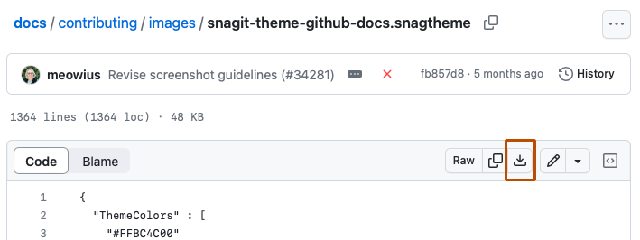
To download the Snagit theme, navigate to
snagit-theme-github-docs.snagthemein thegithub/docsrepository, then click .
-
Open Snagit, then select the Shape tool.
-
Under "Quick styles," select Import.
-
Select the Snagit theme from your computer's files. This will install the shape preset.
-
Optionally, to add the theme to your favorites, star the dark orange rectangle.
Adding a highlight to a screenshot
-
Open a screenshot in Snagit.
-
To set pixel depth (resolution) and pixel width, below the image canvas, open the "Resize image" dialog.
-
Pixel depth: 144dpi (equivalent to "2x" on Snagit for Mac)
-
Pixel width: 1000 pixels maximum
Note
On Windows, you may need to select Advanced to change the resolution. Ensure Use resampling is disabled.
-
-
With the GitHub Docs theme open in the Shapes sidebar, select the dark orange rectangle.
-
Drag and drop across the image to create a rectangle.
-
Adjust the rectangle's height and width by dragging edges. Do not adjust the corner rounding, which should remain 4 px. Adjust the space between the UI element and the stroke so it's about the width of the stroke itself.
-
Export image to PNG.
Note
A bug in Snagit may corrupt the corner rounding, causing rectangles to become ovals. If this occurs, delete and reinstall the GitHub Docs theme (Windows and Mac), or click and drag the yellow dot at the top right of the shape to reset corner rounding to 4 px (Mac only).
Replacing screenshots
When replacing an existing image, best practice is to retain the image's filename.
If you must change an image filename, search the repository for other references to that image and update all references to the original filename.
If the image is used in documentation for versions of GitHub Enterprise Server that are closing down, don't change the filename.
Versioning images in Markdown content
Some images apply to all GitHub plans (GitHub Free, GitHub Pro, GitHub Team, GitHub Enterprise Cloud, and GitHub Enterprise Server). In this case, there is no versioning required.
When an image does differ from plan to plan, or changes in a newer release of GitHub Enterprise Server, the image need to be versioned with Liquid conditional statements. You may need to add this versioning when the content is initially created, or you may need to add it when the content is updated for a feature update or GitHub Enterprise Server release.
Image locations
Images are located in the /assets/images directory. This directory has some sub-directories that can be used to organize content by plan and release number.
| Directory | Usage |
|---|---|
/assets/images | Images that are not specific to any GitHub Enterprise product. |
/assets/images/enterprise/enterprise-server | Images that are applicable to all releases of GitHub Enterprise Server (GHES), or are applicable to the current release and future releases. |
/assets/images/enterprise/<release number>, such as /assets/images/enterprise/3.0/ | When an image is changed in a new GHES release, add the new image to the original location, and move the old image to the directory corresponding to the latest release that the image applies to. |
Example: An image differs between plans
When there are differences between plans, you can use Liquid conditionals to version the two images.
{% ifversion fpt or ghec %}

{% else %}

{% endif %}
Example: An image is updated in a new GitHub Enterprise Server release
If an image will change for GitHub Enterprise Server 3.10, and the updated image will be used for all future versions of GitHub Enterprise Server, move the existing image to /assets/images/enterprise/3.10, then add the new image to the original location, /assets/images/enterprise/foo/bar.png.
Your Liquid conditional would look like this:
{% ifversion fpt or ghec %}

{% elsif ghes < 3.10 %}

{% else %}

{% endif %}
When the 3.10 release is closing down, the /assets/images/enterprise/3.10 directory will be removed.
The numbered release directory should contain images that apply to that release number only or to that release number and earlier. For example, images in /assets/images/enterprise/2.22 should contain images that apply to 2.22 only or 2.22 and earlier.