An R Package for Visualization of 2D Datasets.
November 25 2023: use Polychrome to generate default color schemes for categorical data.
September 6 2020: fix alpha_scale with embed_plotly. Also, new
parameter: limits for embed_plotly.
August 26 2020: version 0.4 includes the following improvements and fixes:
- Fixed bug where using recent versions of paletteer for choosing the color scheme was broken.
- The
turbo colormap
(based on a
github gist)
has been added as the
turbofunction. - New argument
revto reverse the ordering of the colors in the palette. This is useful when comparingturbowith other rainbow palettes becauseturbogoes from blue to red. - For the
new color palettes in R 4.0,
you can pass them by name, e.g.
color_scheme = "Okabe-Ito". colorRampPaletteis only used if you need to interpolate the palette (i.e. if you ask for more colors than exist in the palette). Colors will now be returned in the order they appear in the palette.
September 27 2018: Color schemes with embed_plotly was badly messed up.
This now fixed. You now also have control over whether to interpolate a discrete
palette.
Visualizing datasets in 2D (e.g. via PCA, Sammon Mapping, t-SNE) is much more informative if the points are colored, using something like:
- Factor levels mapped to different colors.
- A numeric value mapped to a color scale.
- A string encoding a color.
This package is to make doing that a bit easier, using the graphics::plot
function, or via the plotly JavaScript library. If you
don't specify a specific column to color by, it will attept to find a suitable
factor or color column automatically, using the last suitable column found, so
you can add a custom column to a dataframe if needed and have it picked out
automatically.
install.packages("devtools")
devtools::install_github("jlmelville/vizier")?embed_plot
?embed_plotlyCreate a plot of the first two principal components (PCA) for the iris
dataset:
pca_iris <- stats::prcomp(iris[, -5], retx = TRUE, rank. = 2)Simplest use of embed_plot: pass in data frame and it will use the last
(in this case, only) factor column it finds and the rainbow color scheme
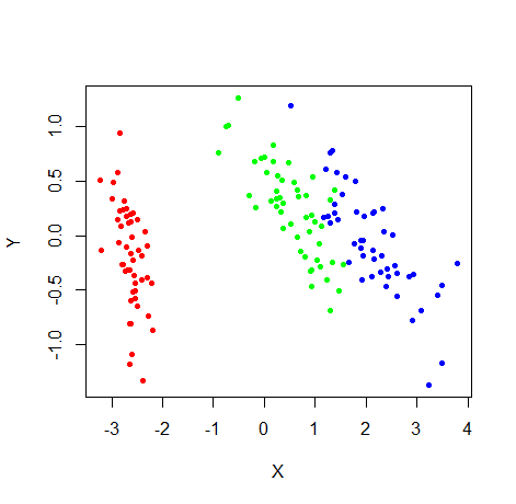
embed_plot(pca_iris$x, iris)More explicitly color by iris species, use the rainbow color scheme and also provide a title and subtitle:
embed_plot(pca_iris$x, iris$Species, color_scheme = rainbow, title = "iris PCA", sub = "rainbow color scheme")Increase the transparency of the fill color by scaling the alpha by 0.5:
embed_plot(pca_iris$x, iris$Species, color_scheme = rainbow, alpha_scale = 0.5)If you already have colors you want to use for each point, you can use the
colors parameter. In the example below,
colorRampPalette(c("red", "yellow"))(nrow(iris))) produces a vector of 150
colors going from red to yellow:
my_iris_colors = colorRampPalette(c("red", "yellow"))(nrow(iris))
embed_plot(pca_iris$x, iris$Species, colors = my_iris_colors)
If you just want the points to be all one color you need only pass a single
value, e.g. colors = "blue". In general, if you pass fewer colors than there
are points, the colors are recycled.
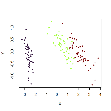
Here's another example of using a built-in palette, topo.colors:
This package also includes the
turbo colormap
as a palette, via the turbo function, which works a lot like
grDevices::rainbow (although reversed in terms of colors):
embed_plot(pca_iris$x, iris$Species, color_scheme = turbo)The rev argument can be used to reverse a color scheme:
embed_plot(pca_iris$x, iris$Species, color_scheme = turbo, rev = TRUE)You can also provide your own palette (i.e. a vector colors):
embed_plot(pca_iris$x, iris$Species, color_scheme = c("black", "red", "gray"))Note that if you have more colors in your palette than needed, the extra ones
are ignored: e.g. if c("black", "red", "gray", "blue"), "blue" would have
been unused, because we only needed three colors from the palette for this plot
for the three species.
Watch out for the opposite situation where you need more colors than your
palette provides. In this case vizier will use interpolation to get the colors
it needs. This might work out for some palettes that represent a continuous
color scale (like rainbow), but will give weird and probably undesirable
results for discrete palettes. For more details, see the section
"Discrete Palettes with continuous Type" below.
As of R 4.0, there are some
new color palettes.
You can see the options available via grDevices::palette.pals() and generate
the palette using grDevices::palette.colors. Here's an example using the "Okabe-Ito"
palette:
if (exists("palette.colors", where = "package:grDevices")) {
  embed_plot(pca_iris$x, iris$Species, color_scheme = palette.colors(palette = "Okabe-Ito"))
}
For any palette in palette.pals, you can also just provide the palette name
as a shortcut:
embed_plot(pca_iris$x, iris$Species, color_scheme = "Okabe-Ito")
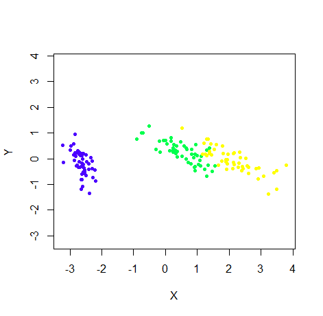
To force axes to be equal size to stop clusters being distorted in one direction:
embed_plot(pca_iris$x, iris$Species, color_scheme = topo.colors, equal_axes = TRUE)You can plot the category names instead of points, but it looks bad if they're
long (or the dataset is large. Making the text a bit smaller with the cex
param can help:
embed_plot(pca_iris$x, iris$Species, cex = 0.75, text = iris$Species)For more color schemes, Vizier makes use of the excellent
paletteer package.
You can select one of the palettes on offer by (among other ways) passing a
string with the format"package::palette". For example, to use the Dark2
scheme from the the
RColorBrewer package
(itself based on ColorBrewer schemes):
embed_plot(pca_iris$x, iris, color_scheme = "RColorBrewer::Dark2")For more on selecting color schemes, see the 'Color Schemes' section below. Here's another example, using a continuous palette from RColorBrewer, useful for mapping numeric vectors to the color:
# Visualize numeric value (petal length) as a color
embed_plot(pca_iris$x, iris$Petal.Length, color_scheme = "RColorBrewer::Blues")
# Just show the points with the 10 longest petals
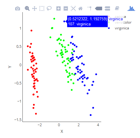
embed_plot(pca_iris$x, iris$Petal.Length, color_scheme = "RColorBrewer::Blues", top = 10)If you install the plotly package,
you can use the embed_plotly function which has the same interface as
embed_plot (except the top and sub parameters are missing). This has the advantage
of showing a legend and tooltips:
embed_plotly(pca_iris$x, iris)# Don't have to see a legend if custom tooltips will do
embed_plotly(pca_iris$x, iris, show_legend = FALSE, tooltip = paste("Species:", iris$Species))Vizier makes use of the wonderful
paletteer package which unifies
the enormous number of palettes out there. To specify a color scheme, use the
color_scheme parameter, passing one of:
- A palette function that takes an integer
nand returns a vector of colors, e.g.grDevices::rainbow. - A vector of colors making up a custom color scheme of your own devising, e.g.
c('red', 'green', 'blue'). There must be at least two colors in the list. - The name of a color scheme provided by
paletteer, in the form"package::palette". For a list of the many, many palettes supported, see paletteer's github page. Some examples include"dutchmasters::milkmaid","cartography::green.pal","viridis::inferno","RColorBrewer::Dark2".viziermakes no distinction between the continuous, fixed-width or dynamic palette classification used bypaletteer.
If the color scheme you select has a maximum number of colors, and vizier
needs to use more than those that are available, then it will interpolate
among the maximum number of colors to create the desired number. This may lead
to results where different categories are hard to distinguish from each other.
If you set verbose = TRUE, then if interpolation is required, a message will
be logged to console to this effect. paletteer has information on the number
of colors available in each palette.
For discrete palettes, if you ask for fewer colors than the full range, you will
only get the first few colors from the palette. For some palettes this works
fine. For example, here is the Dark2 palette from RColorBrewer:
If you use this palette to color the iris PCA:
The three colors from the lefthand side of the swatch are used to color the species.
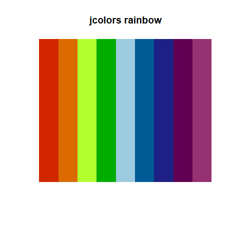
However, some discrete palettes have an ordering to them, e.g. they go to from
red to blue via yellow. Here's rainbow from the jcolors package:
The PCA embedding now looks like:
If you would prefer to use a fuller extent of the palette, you can treat the
palette as continuous, by appending ::c to the name of the color scheme,
e.g. "jcolors::rainbow::c". Now the result is:
where the colors come from the left-most, right-most and center positions on the swatch.
The downside to treating these palettes as continuous is that there is no
guarantee that the interpolation will result in colors that actually come from
the palette. In fact, they probably won't. We just got lucky in the above
example, because interpolating between colors was not required. For colors which
show a natural progression like jcolors::rainbow, results should still be ok.
However, for palettes like RColorBrewer::Dark2, interpolation may not turn out
so well. The iris PCA with the "continuous" version of Dark2, i.e. specifying
RColorBrewer::Dark2::c results in:
The left cluster uses the green from the left-hand of the Dark2 swatch, and the right cluster is colored in the gray color from the right-hand side. But the middle cluster isn't any of the other colors and mixes rather murkily with the gray cluster. It doesn't make sense to use interpolation in this case.
In summary, avoid interpolation of discrete color schemes if you can, and
definitely do avoid for those like RColorBrewer::Dark2 which don't work on a
color scale.
GPL-3. The code for the
turbo color scheme is from https://gist.github.com/jlmelville/be981e2f36485d8ef9616aef60fd52ab
and is licensed under Apache 2.
