Pricing
Get Started
  • Introduction
  • Installation
  • MCP Server
  • Saved
Site
  • Builder (Beta)
  • Pricing
  • Roadmap
  • Affiliates
Browse
  • All Components25 New
Text32
Reveal & Decode11
  • Blur Highlight
  • Cipher Reveal
  • Ghost Type
  • Glyph Lottery
  • Luminous Type
  • Signal Type
  • Smoke Type
  • Staggered Text
  • Text Morph
  • Typographic Wall
  • Vapor Type
Kinetic & 3D11
  • 3D Letter Swap
  • 3D Text Reveal
  • Bending Marquee
  • Mesh Lettering
  • Orbital Type
  • Ribbon Type
  • Rising Ink
  • Speeding Text
  • Text Cube
  • Text Path
  • Wave Lettering
Interactive & Physics10
  • ASCII Ripple
  • Domino Lettering
  • Elastic Lettering
  • Glitch Text
  • Gravity Letters
  • Particle Text
  • Shatter Type
  • Spring Lettering
  • Stipple Type
  • Text Scatter
Backgrounds106
Gradients & Fluids21
  • Aura Blob
  • Aurora Blur
  • Chroma Waves
  • Cloud Atlas
  • Color Loops
  • Glowing Ridges
  • Gradient Bars
  • Gradient Blob
  • Grain Wave
  • Liquid Bars
  • Minimal Ripple
  • Radial Liquid
  • Rubber Fluid
  • Satin Ridges
  • Shader Waves
  • Silk Waves
  • Simple Swirl
  • Spectral Clouds
  • Stipple GradientNew
  • Swirl Blend
  • Watercolor
Light & Beams14
  • Aurora Beam
  • Axial Beam
  • Blurred Rays
  • Chroma Blinds
  • Dappled Light
  • Eclipse
  • Falling Rays
  • Flame Paths
  • Horizon Bloom
  • Light Droplets
  • Neon Reveal
  • Nexus Rays
  • Rolling Blinds
  • Shadow Bars
Lines & Filaments12
  • Concentric Tides
  • Glowing Wave
  • Interference Ribbons
  • Liquid Lines
  • Long Exposure
  • Luminous Filaments
  • Neural Flash
  • Neural Float
  • Rising Lines
  • Spiral Funnel
  • Synaptic Shift
  • Twilight Lines
Dots & Pixels22
  • Blinking Dots
  • Blinking Squares
  • Chroma Current
  • Circuit FlashNew
  • Cursor Wave
  • Dither Wave
  • Dot Shift
  • Dotted WavesNew
  • Glue Dots
  • Grid Rise
  • Halftone Vortex
  • Halftone Wave
  • Hexagonal Vault
  • Mosaic
  • Mosaic Waves
  • Pixel Rain
  • Square Matrix
  • Squares Terminal
  • Squircle Shift
  • Tech Wall
  • Thinking Dots
  • Voxel Arc
Particles & Space11
  • Astral Shell
  • Binary Orbits
  • Contour Tide
  • Fading Stars
  • Glimmer Wrap
  • Grain MassNew
  • Ring Field
  • Rising Particles
  • Rotating Stars
  • Spectral Drape
  • Star Burst
Horizons & Tunnels10
  • Glitter Warp
  • Landscape
  • Lightspeed
  • Neural Tunnel
  • Perspective Grid
  • Ravine
  • Retro Lines
  • Star Swipe
  • Vortex
  • Warp Twister
ASCII & Glyphs9
  • ASCII StreamNew
  • ASCII Tiles
  • Ascii Waves
  • Glyph Ember
  • Glyph Orb
  • Glyph Sonar
  • Glyph Tide
  • Liquid Ascii
  • Terminal Rain
Glass & Chrome7
  • Glass CoinsNew
  • Glass Flow
  • Glass KeysNew
  • Glass Tiles
  • Metallic Swirl
  • Prismatic Slats
  • Spectral TilesNew
Images & Galleries52
Galleries & Carousels33
  • Album Rail
  • Bend Gallery
  • Circle Gallery
  • Circle Stack
  • Circles
  • Concave Carousel
  • Constellation Gallery
  • Contact Sheet
  • Depth Ribbon
  • Dolly Gallery
  • Draggable Grid
  • Elastic Reel
  • Expanding Grid
  • Gradient Carousel
  • Helix Gallery
  • Infinite Gallery
  • Inverted Dome
  • Iris Gallery
  • Lenticular Carousel
  • Liquid CirclesNew
  • Momentum Ring
  • Orbit Reel
  • Parallax Carousel
  • Passage Gallery
  • Prism Carousel
  • Reel Gallery
  • Rotating Cards
  • Scroll Bend
  • Skewed Carousel
  • Spin Shutter
  • Tilted Tiles
  • Tumble Carousel
  • Twisting Gallery
Image Effects14
  • Comparison Slider
  • Depth Image
  • Ember Reveal
  • Glass Reveal
  • Hover Preview
  • Liquid Swap
  • Loupe Image
  • Particle Image
  • Particle Morph
  • Pixel Reveal
  • Pixel Sculpt
  • Pixelate Hover
  • Pond Image
  • Shader Reveal
Scroll Stories5
  • Frame Scrub
  • Scroll Mask
  • Scroll Portal
  • Scroll Stack
  • Tile Reveal
Interface30
Cards & Widgets15
  • Animated ListUpdated
  • Arc ListNew
  • Card Spread
  • Chroma Card
  • Click Stack
  • Credit Card
  • Depth Card
  • Frame Border
  • Modal Cards
  • Parallax Cards
  • Parallax Pills
  • Preloader
  • Shader Card
  • SignatureNew
  • Warped Card
Product Mockups8
  • Browser WindowNew
  • Center Flow
  • Code MorphNew
  • Device
  • Magic Transform
  • PipelineNew
  • Spin ViewerNew
  • Terminal ReplayNew
Data & Media7
  • Globe
  • Instrument DialNew
  • Particle ChartNew
  • Signal MapNew
  • Simple Graph
  • Story PlayerNew
  • Waveform PlayerNew
3D & Tactile16
Orbs & Shapes9
  • Agentic Ball
  • AI Blob
  • Black Hole
  • Chrome Orbit
  • Fog Sphere
  • Photon Knot
  • Portal
  • Specter Orb
  • Wireframe Ball
Tactile & Physics7
  • Elastic Sticker
  • KeycapsNew
  • Page Flip
  • Pin ScreenNew
  • Receipt PrinterNew
  • Scratch CardNew
  • Tumble Wall
Cursors19
Custom Cursors7
  • Custom Cursor
  • Drafting Cursor
  • Glass Cursor
  • Gyroscope Cursor
  • Label Orbit
  • Smooth Cursor
  • User Cursor
Cursor Trails12
  • Arc Cursor
  • Ascii Cursor
  • Celebration Cursor
  • Chroma Halo
  • Dither Cursor
  • Glyph Stream
  • Pigment Trail
  • Pixel Magnet
  • Ribbon Trail
  • Snapshot Trail
  • Stardust Cursor
  • Tessera Trail
  1. Docs
  2. Components
  3. Images & Galleries
  4. Galleries & Carousels
  5. Draggable Grid

Animated components, blocks, and templates for React. Pay once, ship stunning pages forever.

pro@reactbits.dev

Site

HomeBuilder (Beta)PricingTestimonialsFAQsRoadmapChangelogFree Components

Docs

IntroductionInstallationMCP ServerComponentsBlocksTemplates

Resources

AboutUse casesComparisonsAlternativesFor AI agents

Legal & Account

LoginAffiliateLicensePrivacyContact

© 2026 pro.reactbits.dev. All rights reserved.

Draggable Grid

A grid you can drag around with smooth momentum

draggable-grid-tw
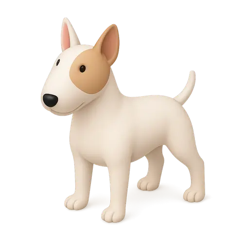
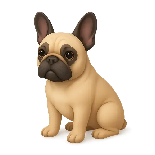
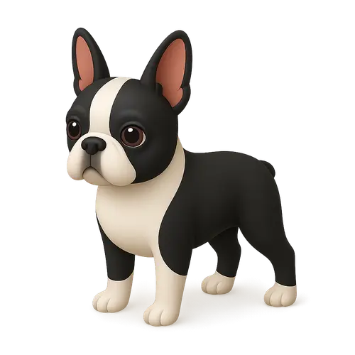
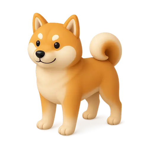
Dog 1
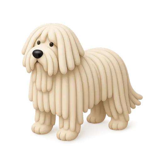
Dog 3
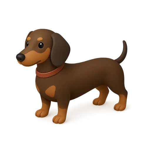
Dog 2
Dog 5
Dog 1
Dog 2
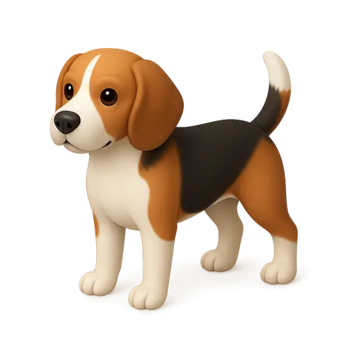
Dog 4
Dog 7
Dog 1
Dog 2
Dog 3
Dog 6
Dog 4
Dog 7
Dog 1
Dog 3
Dog 1
Dog 7
Dog 1
Dog 2
Dog 3
Dog 3
Dog 5
Dog 4
Dog 1
Dog 7
Dog 5
Dog 1
Dog 1
Dog 2
Dog 2
Dog 3
Dog 4
Dog 4
Dog 1
Dog 2
Dog 7
Dog 2
Dog 5
Dog 3
Dog 6
Dog 7
Dog 3
Dog 7
Dog 5
Dog 5
Dog 4
Dog 7
Dog 3
Dog 3
Dog 3
Dog 3
Dog 5
Dog 4
Dog 3
Dog 3
Dog 1
Dog 4
Dog 5
Dog 5

Customize

Item Count
60
Columns
10
Scale
0.6
Gap (vw)
6.0
Edge Resistance
0.9
Intro Duration
0.5
Wheel Smoothing
1.00

Props

15
NameTypeDefaultDescription
itemsGridItem[][]Array of items to display in the grid. Each item has id, image, dataId, and alt.
columnsnumber10Number of columns in the grid layout.
enableDragbooleantrueEnable drag functionality to move the grid around.
enableWheelbooleantrueEnable mouse wheel scrolling to navigate the grid.
edgeResistancenumber0.9Edge resistance when dragging (0-1). Higher values provide more resistance.
introDurationnumber1.2Duration of the intro animation in seconds.
onItemClick(item: GridItem, index: number) => voidundefinedCallback function when an item is clicked.
classNamestring""Additional CSS classes for the main container.
gridClassNamestring""Additional CSS classes for the grid container.
itemClassNamestring""Additional CSS classes for individual grid items.
boundsPadding{ x: number; y: number }{ x: 200, y: 100 }Padding in pixels for drag bounds.
containerMode"fixed" | "absolute""absolute"Container positioning mode. 'fixed' for full viewport overlay, 'absolute' for contained layout.
scalenumber1Scale factor for the entire grid. 0.5 = half size, 2 = double size.
gapnumber5Gap between items in viewport width units (vw).
wheelSmoothingnumber0.3Wheel scroll smoothing duration in seconds (0.1-1.0). Higher values create smoother, slower scrolling.
itemsGridItem[]

Array of items to display in the grid. Each item has id, image, dataId, and alt.

Default[]
columnsnumber

Number of columns in the grid layout.

Default10
enableDragboolean

Enable drag functionality to move the grid around.

Defaulttrue
enableWheelboolean

Enable mouse wheel scrolling to navigate the grid.

Defaulttrue
edgeResistancenumber

Edge resistance when dragging (0-1). Higher values provide more resistance.

Default0.9
introDurationnumber

Duration of the intro animation in seconds.

Default1.2
onItemClick(item: GridItem, index: number) => void

Callback function when an item is clicked.

Defaultundefined
classNamestring

Additional CSS classes for the main container.

Default""
gridClassNamestring

Additional CSS classes for the grid container.

Default""
itemClassNamestring

Additional CSS classes for individual grid items.

Default""
boundsPadding{ x: number; y: number }

Padding in pixels for drag bounds.

Default{ x: 200, y: 100 }
containerMode"fixed" | "absolute"

Container positioning mode. 'fixed' for full viewport overlay, 'absolute' for contained layout.

Default"absolute"
scalenumber

Scale factor for the entire grid. 0.5 = half size, 2 = double size.

Default1
gapnumber

Gap between items in viewport width units (vw).

Default5
wheelSmoothingnumber

Wheel scroll smoothing duration in seconds (0.1-1.0). Higher values create smoother, slower scrolling.

Default0.3

Demo images from thiings.co, not part of the React Bits Pro offer.